Problematic
Introduction
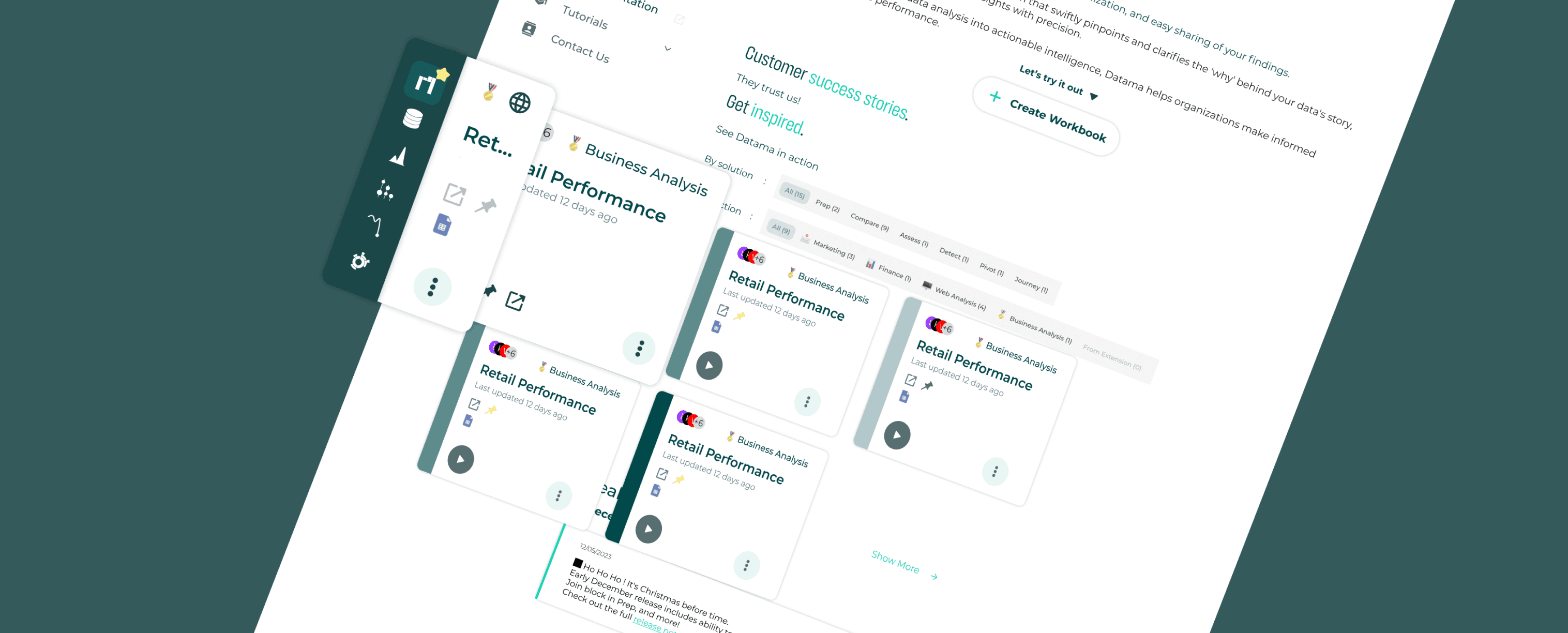
UI visualization
Process
Method used
UI kit button
Impact
Conclusion
Most of us see design systems as a way to streamline workflows.
But for teams navigating complexity, they make
innovation possible.
This is my story of building Datama’s design system in figma (UI Kit) from scratch; solo, and in a startup rhythm with some other side-mission aside from this. I had no base to work from, but I didn’t start blind either. I leaned on Google’s Material Design for structure, ran a quick UI audit to catch inconsistencies, and even explored Angular Material to match the devs’ tech stack. Every choice was intentional
Crafting a Scalable Design System
Team
solo
Timeline
3 months
(side-project)
Role
Pinterest, figma, Miro, Github, ChatGPT, icons8
Tool & Resources
Product Designer
Reduced UI inconsistencies across the product
Problem to solve
“The absence of a structured design system for the application led to inconsistent button styles across the interface. Without clear guidelines, variations in size, color, and interaction behavior disrupted visual harmony and usability. Navigation became less intuitive, affecting both user experience and the development process.”
Let’s fix that.
Why it mattered?
Without structure, every new feature felt like starting from scratch; for both design and dev. Every new feature required manually adjusting buttons, leading to inefficiencies and potential design debt. As the sole designer, I needed a scalable solution to streamline the interface while ensuring a cohesive user experience.
Example of the UX button problem
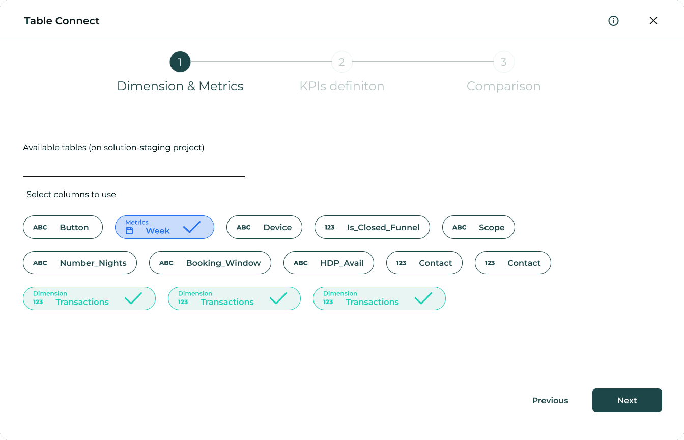
Table connect redesign
The “Dry Run” button feels visually heavier than “Next” and it breaks the natural flow. It’s placed way off to the side while the user is supposed to move step-by-step from left to right. “Next” should be the clear call to action, but right now it feels secondary. The hierarchy was off. The CTA didn’t guide the user; it confused them. So I fixed it.
Old Design

New Figma Design
Old Design

New Figma Design

What was improved?
The “Dry Run” button feels visually heavier than “Next” and it breaks the natural flow. It’s placed way off to the side while the user is supposed to move step-by-step from left to right. “Next” should be the clear call to action, but right now it feels secondary. The hierarchy was off. The CTA didn’t guide the user; it confused them. So I fixed it.
Sign-In design
The “Dry Run” button feels visually heavier than “Next” and it breaks the natural flow. It’s placed way off to the side while the user is supposed to move step-by-step from left to right. “Next” should be the clear call to action, but right now it feels secondary. The hierarchy was off. The CTA didn’t guide the user; it confused them. So I fixed it.
Old Design
New Figma Design
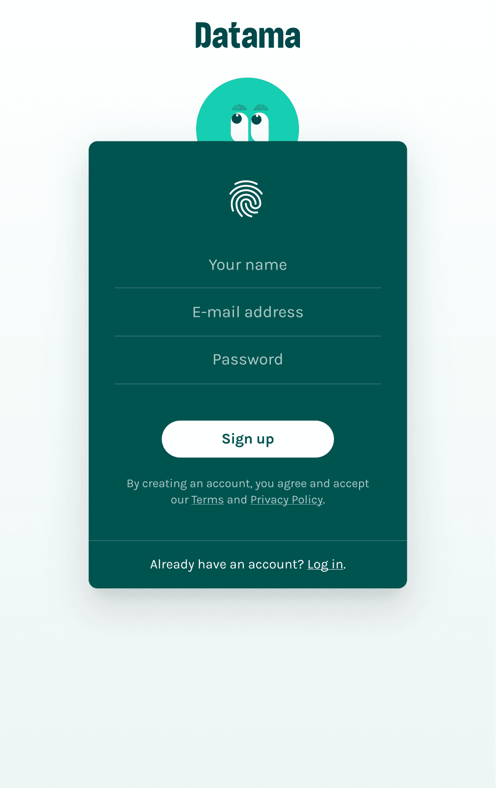
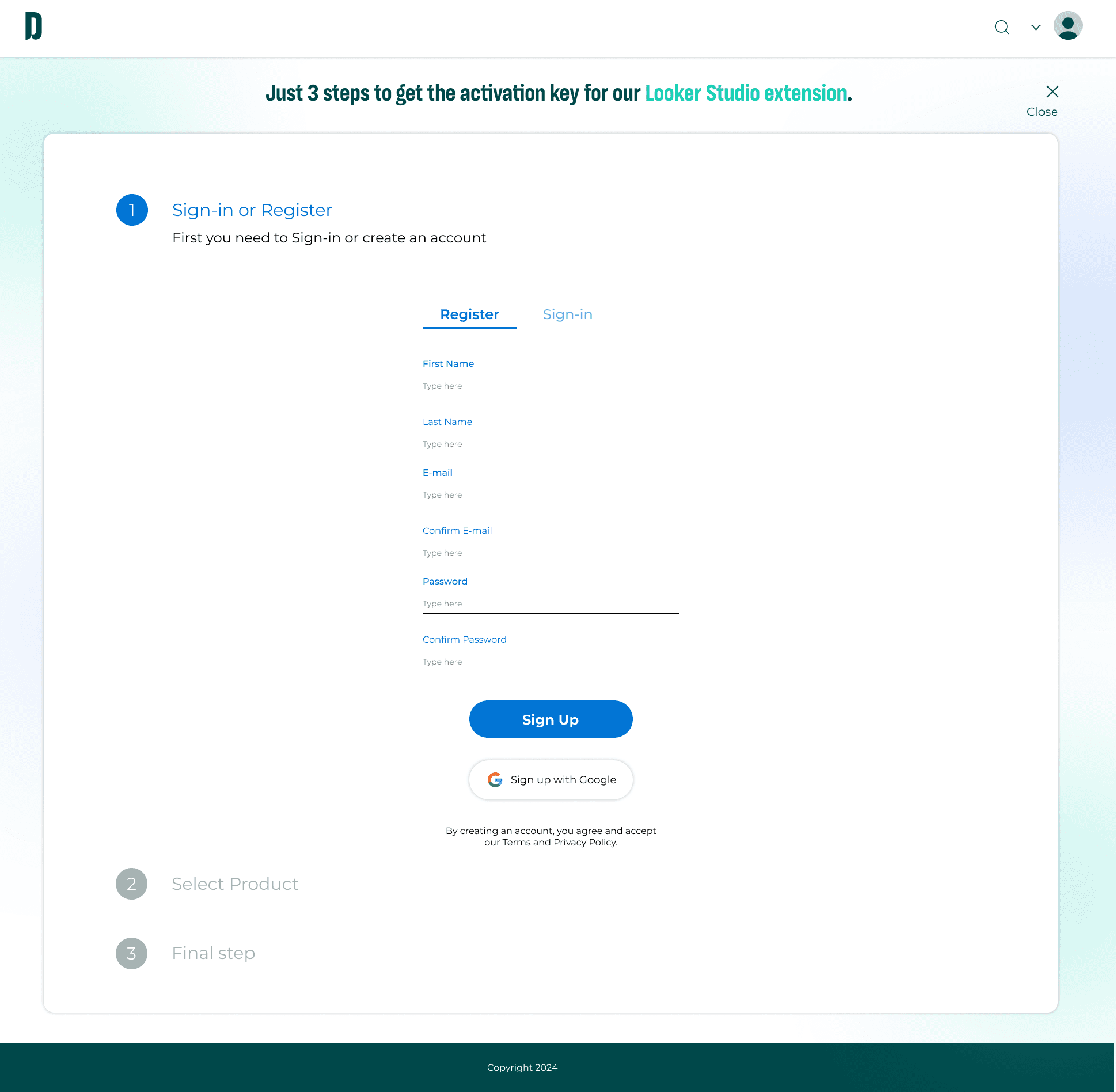
Old design
The old design used a dark, heavy block layout that made the form feel tight and intimidating.
A fingerprint icon appeared clickable but did nothing, creating confusion and breaking user expectations.
It lacked proper field structure, like confirm password or registration clarity.
There was no sign-in toggle, forcing users to scroll or search elsewhere.
The CTA (“Sign up”) didn’t stand out as a primary action.
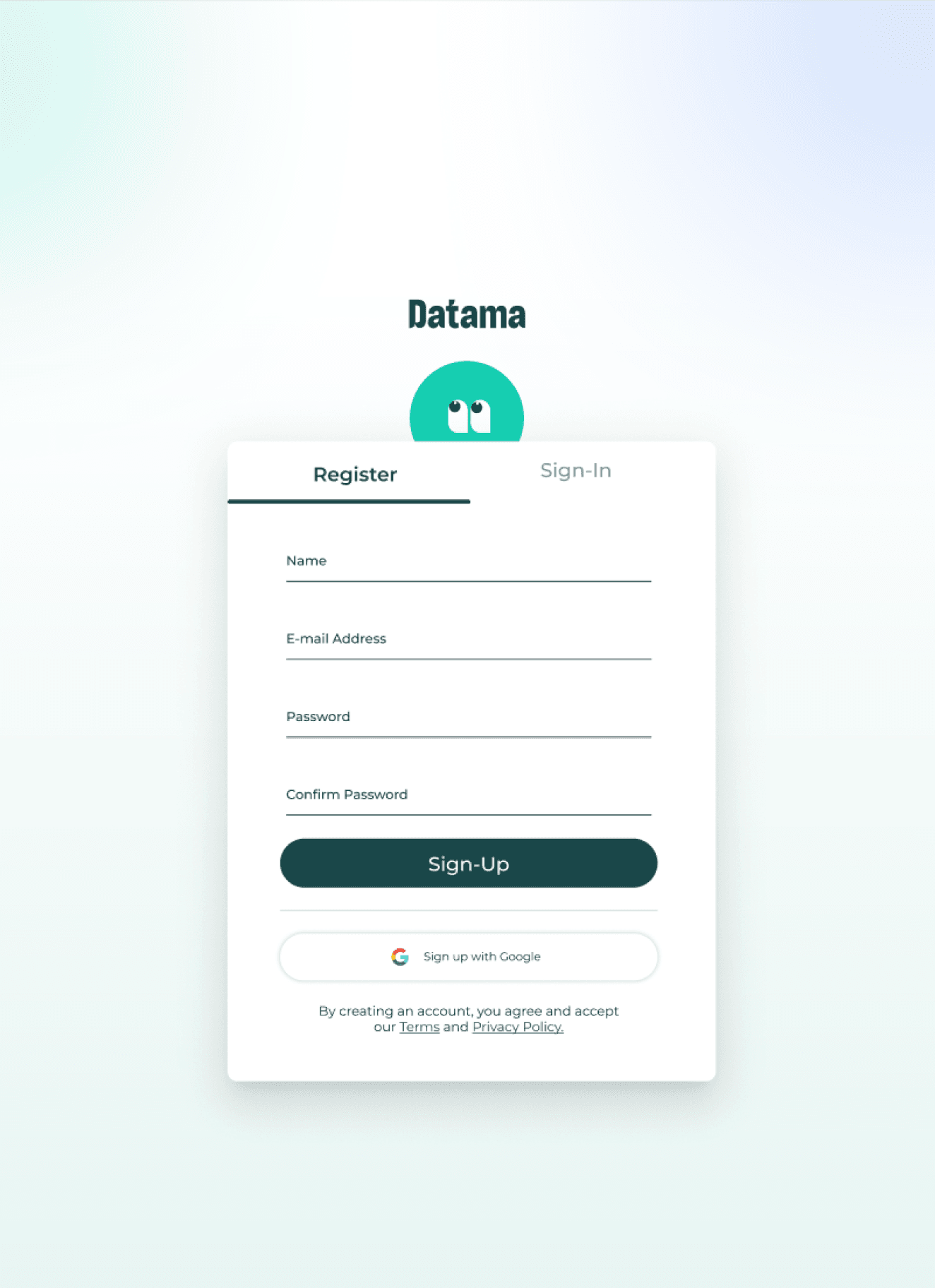
What was improved?
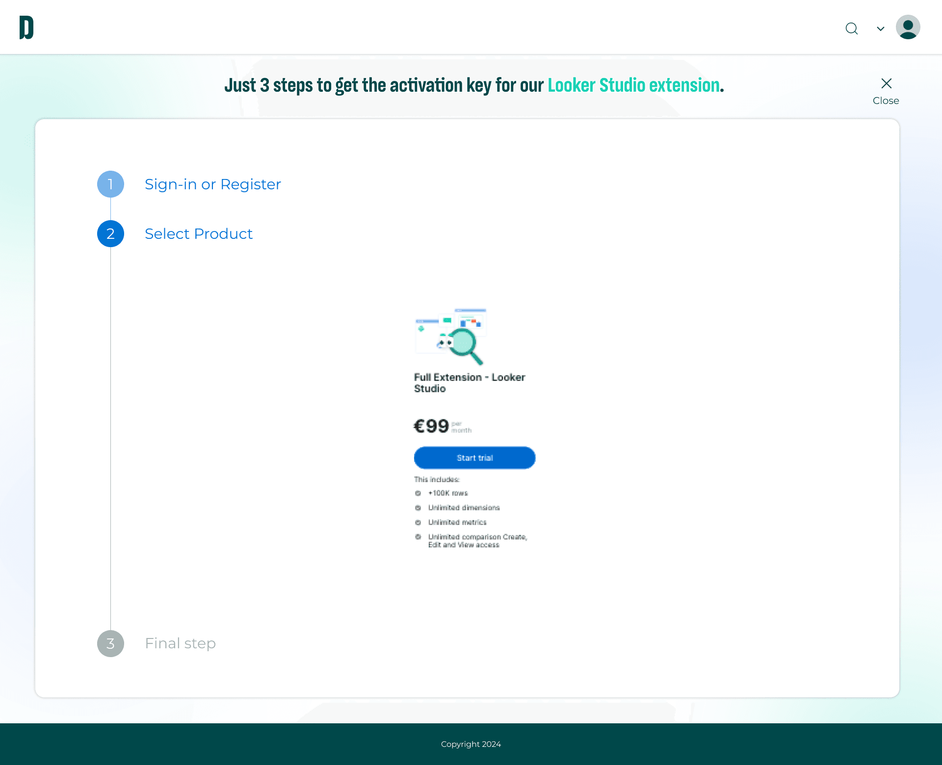
Introduced tabbed navigation between Register and Sign-In for a seamless switch.
Added confirm password field to reduce entry mistakes.
Included a “Sign up with Google” button for faster onboarding.
Lightened the layout with more spacing, softer background, and better field alignment to improve readability.
CTA is now strong and centered, with clear visual weight and hierarchy.
Payment
The old layout combined login, product selection, and final steps all at once, overwhelming the user. The structure didn’t follow a logical flow and made it unclear what to do next. So I broke it into steps to guide the user one screen at a time.
Step 1 → Sign-in/Register
This screen is focused only on account creation to help users stay focused and avoid distractions.
Old Design
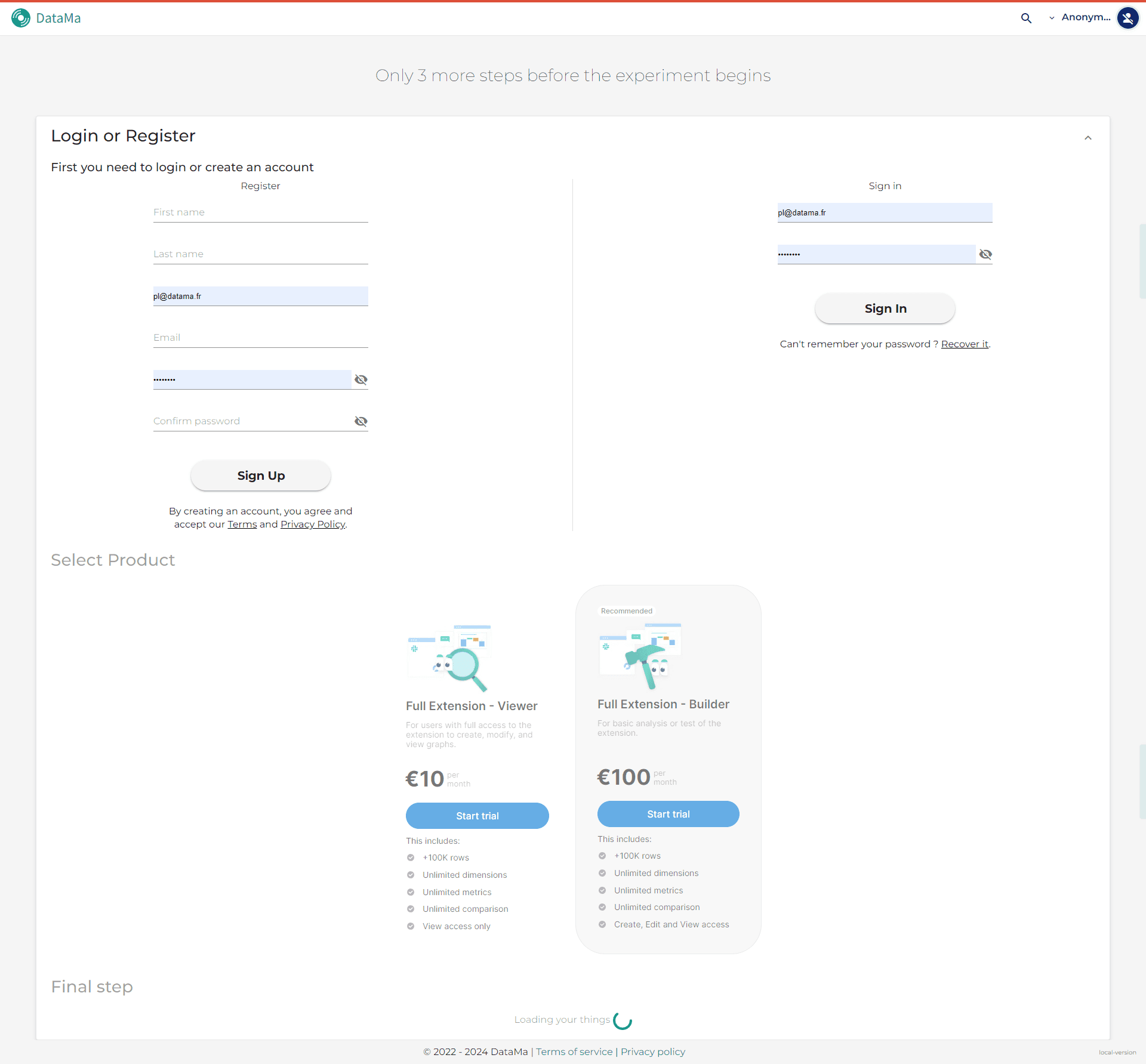
New Figma Design
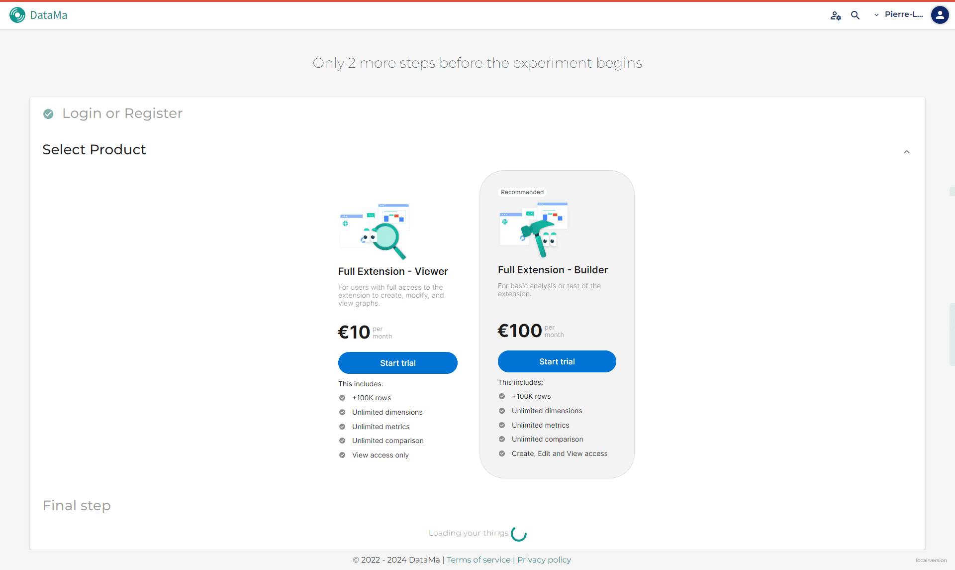
Step 2 → Product selection
Once logged in, users choose a plan. The CTA only appears when relevant.
Old Design
New Figma Design
Steps were all shown together, making the experience feel cluttered.
CTAs like “Start Trial” appeared too early, before the user even signed in.
Lack of step indication made the process confusing and flat.
What was improved?
Broke the flow into clear progressive steps with a left-hand stepper.
Focused on one task at a time to reduce cognitive load.
Placed the CTA inside the flow, keeping user attention centered.
Enhanced alignment and spacing for cleaner, more readable UI.
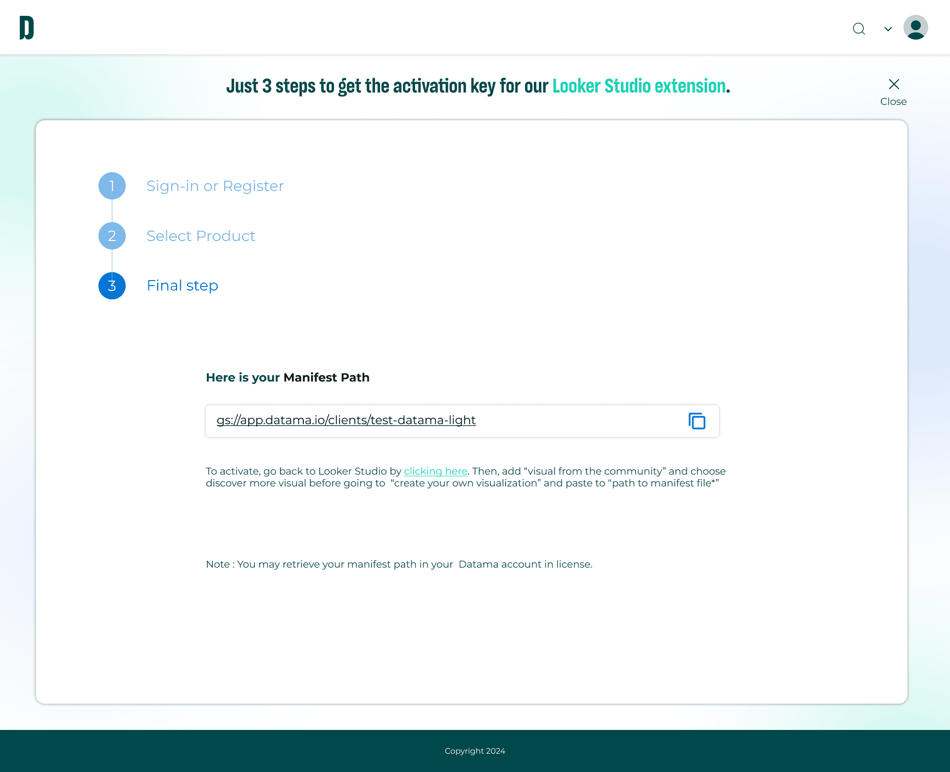
Step 3 → Final step (Manifest path)
The user receives clear instructions with a copy button, reinforcing completion.
Old Design

New Figma Design
Old design
In the old version, all sections were visible at once : login, pricing, and final step, which overwhelmed the user and broke the flow.
CTAs like “Start Trial” appeared too early, before the user even signed in.
There was no step indication, making the process feel flat and confusing.
The final step (manifest path) was not visually emphasized and lacked proper instruction.
What was improved?
The process is now broken into three clear steps using a left-hand stepper.
Each step appears only when relevant, guiding the user naturally from start to finish.
The CTA appears in context — centered and clearly tied to the current step.
The final screen includes the manifest path, with clear instructions and copy button to improve usability.
Visual hierarchy, spacing, and flow were refined to reduce cognitive load and improve clarit

Challenges
Despite briefly learning about design systems from Ismaïl Hamila. At Prisma Media, I briefly worked under Ismaïl Hamila and saw what a well-built system looked like. At Datama, I had the chance to build one from scratch.
I didn’t overcomplicate things. I stuck to what I already knew; Google’s Material Design. It’s simple, logical, and familiar for most devs. I ran a quick UI audit at Datama to spot inconsistencies and used that to build a strong base. Datama allowed me to build one from scratch.
Despite a tight timeline, I successfully developed a button system while redesigning 5–15 screens that previously lacked consistency. Working as the sole designer in a cross-functional team, I made it a priority to create a system that was intuitive and easy for engineers to implement; ensuring efficiency and alignment across the product.
Process
With limited time,
I prioritized efficiency.
1. Start with what works
I quickly studied best practices for button systems, I didn’t reinvent the wheel. I referenced Google’s Material Design; clean, logical, dev-friendly, and user-friendly. Then I ran a UI audit to spot inconsistencies and get a baseline for what to fix.
Below are snapshots of my early research and UI audit; referencing Google’s Material Design and analyzing existing component systems. This helped me define patterns, spot inconsistencies, and plan how to structure Datama’s design system from a real, functional base.
2. Putting the affordance and signifiers to start with what works
I quickly studied best practices for button systems, I didn’t reinvent the wheel. I referenced Google’s Material Design; clean, logical, dev-friendly, and user-friendly. Then I ran a UI audit to spot inconsistencies and get a baseline for what to fix.


Between Old design vs. Figma design
Impact
What's the outcome of this?
Analysts were able to navigate and select data with less confusion.
The new design helped build trust in the platform by making interactions more intuitive.
The design of this new interface has contributed to a 365% increase in application adoption, aligning with the goal whereas the application produce more income than service compared to last year, showing the real impact of aligning intuitive UX with actual user behavior and business goals.
Conclusion
What I learn from this?
Moving forward, I’d start by validating the redesign through usability testing with analysts and internal teams. I’d also keep an eye on long-term usage data to surface deeper pain points and better inform iterations. If I had the chance to do this again, I’d collaborate earlier with developers and stakeholders together at once to align from the beginning and reduce back-and-forth.
Built Datama’s design system in figma or all UI kit from scratch as the sole designer, ensuring speed, consistency, and scalability across 15+ pages
Created modular components to reduce UI inconsistency and support future growth
Adapted to a hybrid rhythm (alternance), staying highly punctual and fast on delivering design without sacrificing quality
Structured Figma files and documentation for easy use by non-designers and smoother dev handoff
Explored Angular Material and Python to better support dev and data teams
Led homepage redesign, improving brand perception and client trust through a cleaner visual identity

Crafting a scalable design system →