Old design
Most of us see design systems as a way to streamline workflows.
But for teams navigating complexity, they make
innovation possible.
This is my story of building Datama’s design system in figma (UI Kit) from scratch; solo, and in a startup rhythm with some other side-mission aside from this. I had no base to work from, but I didn’t start blind either. I leaned on Google’s Material Design for structure, ran a quick UI audit to catch inconsistencies, and even explored Angular Material to match the devs’ tech stack. Every choice was intentional
Crafting a Scalable Design System
Team
solo
Timeline
3 months
(side-project)
Role
Pinterest, figma, Miro, Github, ChatGPT, icons8
Tool & Resources
Product Designer
Saved 25% of Dev Time with a Scalable Design System
Problem to solve
“As Datama scaled, maintaining consistent UI across the product became harder, especially when syncing design updates with developers. Small style changes introduced inconsistencies that disrupted both the user experience and the dev workflow. To solve this, I introduced a token-based design system to unify components, reduce rework, and speed up collaboration.”
Let’s fix that.
Why it mattered?
Without a shared system, each new feature introduced small inconsistencies, from button styles to layout decisions that disrupted both the design flow and developer implementation. It slowed things down, created unnecessary rework, and made the interface harder to maintain. I introduced a scalable solution to streamline the UI and reduce friction between design and development.
Example of the UI/UX button problem
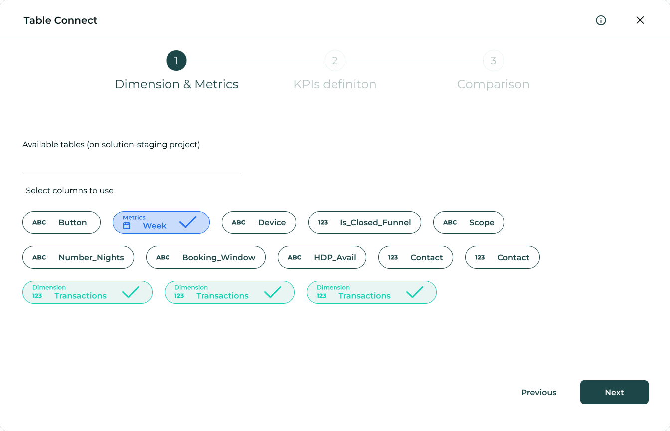
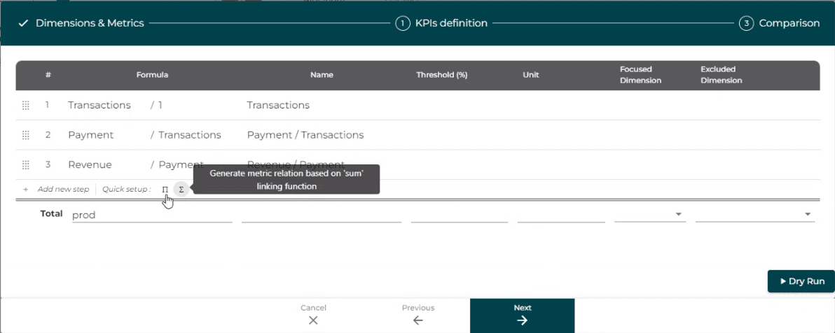
1. Table connect redesign
The “Dry Run” button felt visually heavier than “Next,” breaking the left-to-right flow and confusing users about what action to take. Beyond layout, its actual purpose wasn’t clear.- even internally, there was confusion about when and why it should be used. After reviewing the flow with the co-founder, we agreed to remove it entirely. Simplifying the interaction allowed “Next” to become the clear, singular CTA. aligned to user expectations and product intent.
Step 1 → Dimension & Metrics
This screen lets users define dimensions and metrics for their dataset before continuing the setup.
Old Design

New Figma Design
Step 2 → KPIs definition
Users select and map KPIs relevant to their goals, ensuring alignment before data processing.
Old Design
New Figma Design

Step 3 → Comparison
This screen allows users to compare selected metrics and KPIs before finalizing the table connection.
Old Design

New Figma Design

Old design
The “Dry Run” button felt visually heavier than “Next” and broke the natural flow. It was placed far to the side, while “Next”, the actual CTA, felt secondary. The hierarchy was off and confused users.
What was improved?
Removed the “Dry Run” button entirely
Made “Next” the only CTA, following the left-to-right logic
Improved visual clarity and focus per screen
Reduced user hesitation and decision fatigue
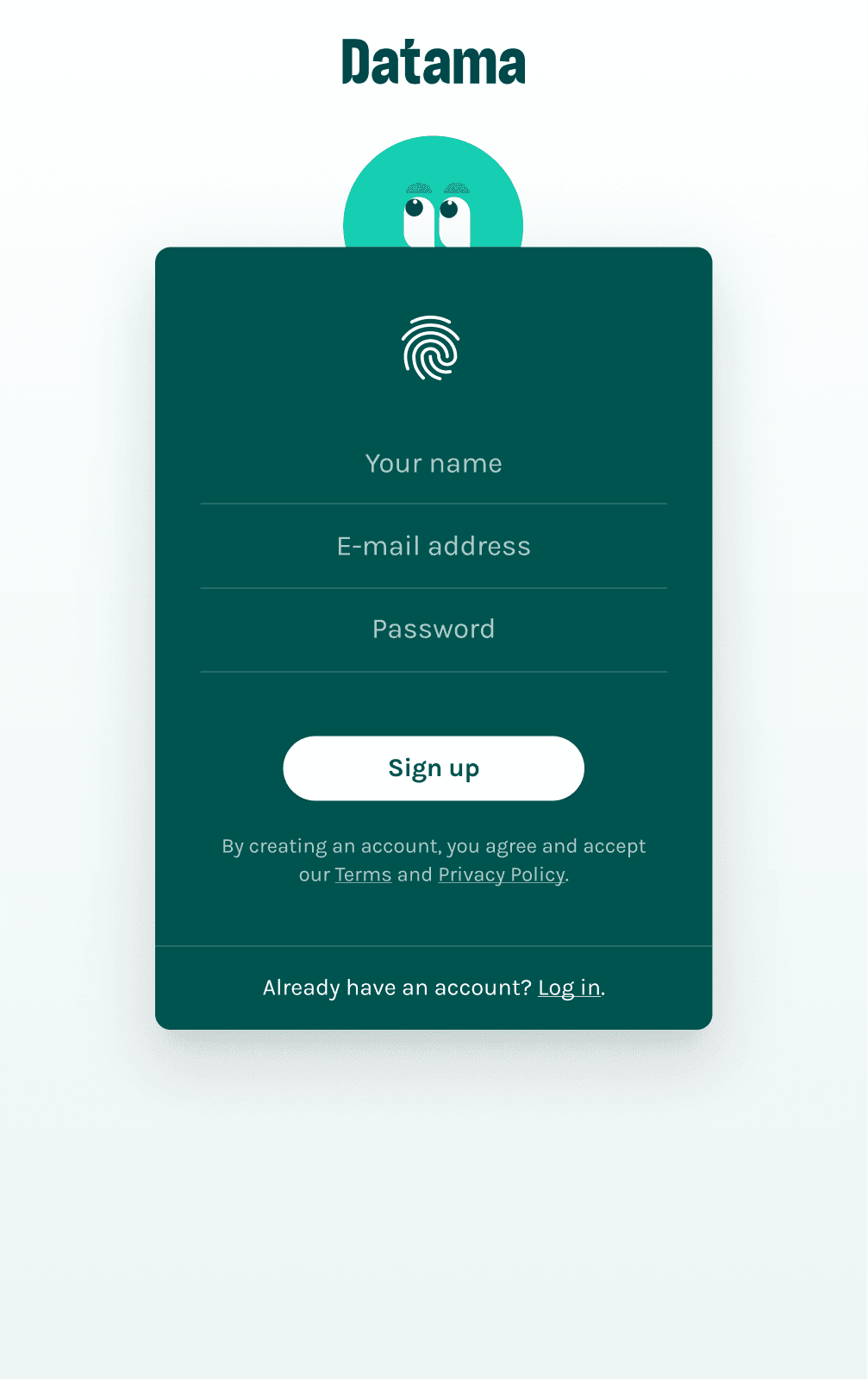
2. Sign-In design
The original sign-in flow lacked clarity, structure, and visual balance. The fingerprint icon created a false sense of interactivity, while the missing field logic and unclear CTA placement made onboarding more difficult than it needed to be. By refining the layout, introducing proper field structure, and adding tabbed navigation, the new design created a cleaner, more intuitive experience, reducing errors and simplifying the handoff for implementation.
Old Design
New Figma Design

Old design
The layout was dark and dense, making the form feel cramped and visually heavy.
A fingerprint icon looked interactive but did nothing; breaking expectations and adding unnecessary confusion.
The field structure was incomplete, lacking confirmation fields and clear sign-up guidance.
There was no way to toggle between Register and Sign-In, forcing users to scroll or search manually.
The primary CTA (“Sign up”) lacked emphasis and didn’t stand out as the next step.
What was improved?
Introduced tabbed navigation between Register and Sign-In for a smoother experience.
Added a confirm password field to help prevent user errors.
Included a “Sign up with Google” option for quicker onboarding.
Lightened the visual design with more spacing, softer background, and cleaner field alignment.
Elevated the CTA placement and styling to create a clear, visible action with stronger hierarchy.
3. Payment Gateaway
The old layout combined login, product selection, and final steps all at once, overwhelming the user. The structure didn’t follow a logical flow and made it unclear what to do next. So I broke it into steps to guide the user one screen at a time.
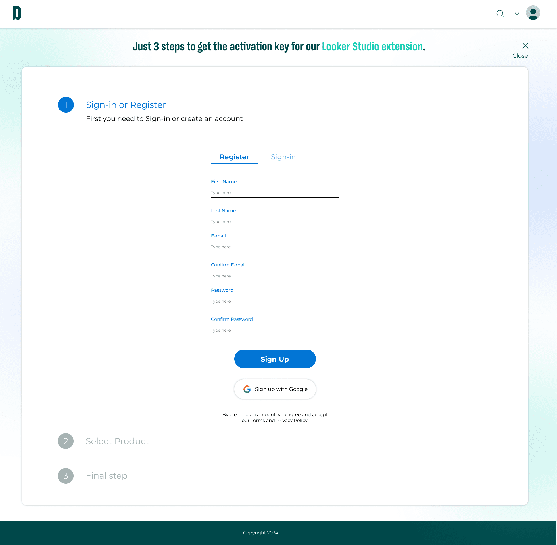
Step 1 → Sign-in/Register
This screen is focused only on account creation to help users stay focused and avoid distractions.
Old Design
New Figma Design
Step 2 → Product selection
Once logged in, users choose a plan. The CTA only appears when relevant.
Old Design
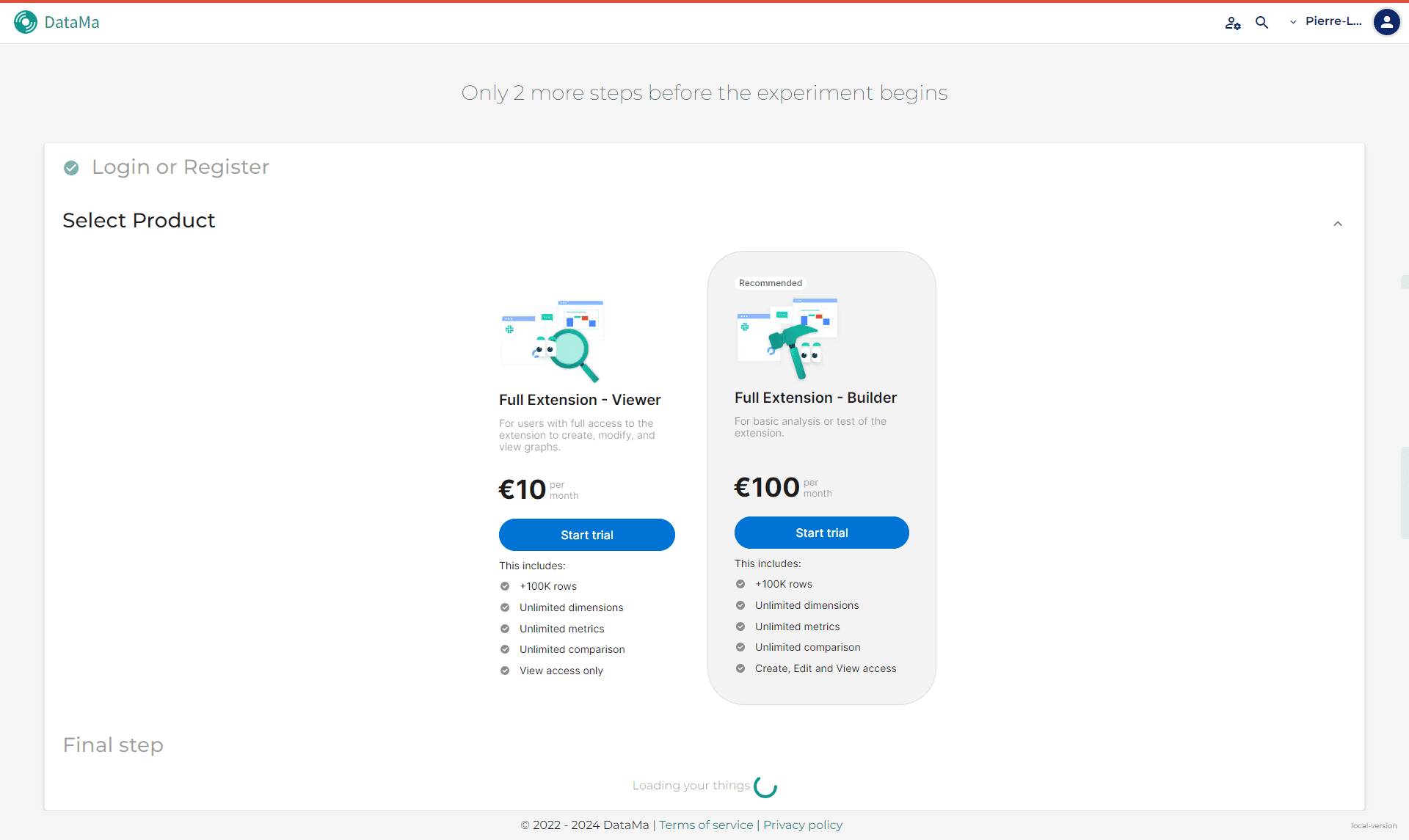
New Figma Design
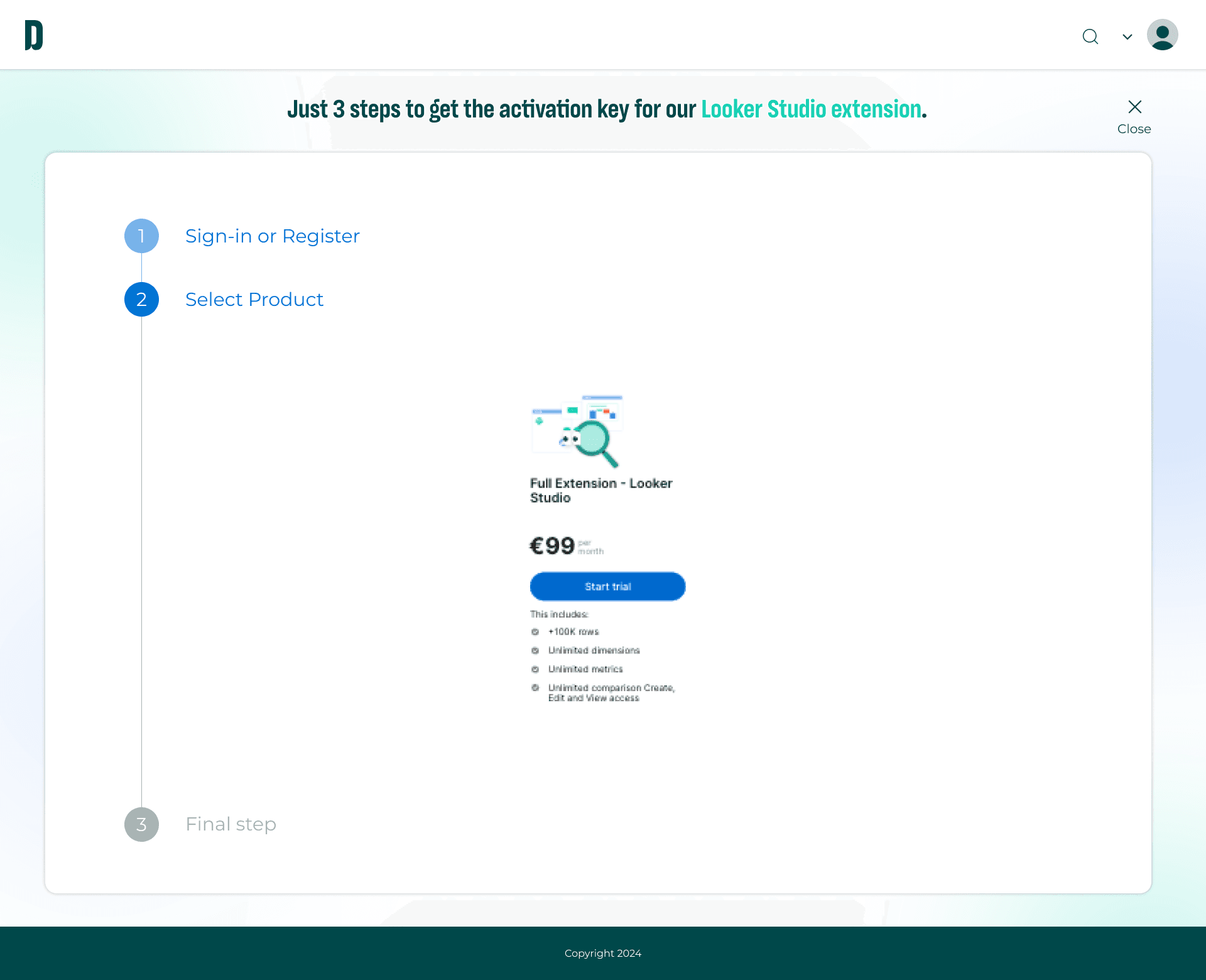
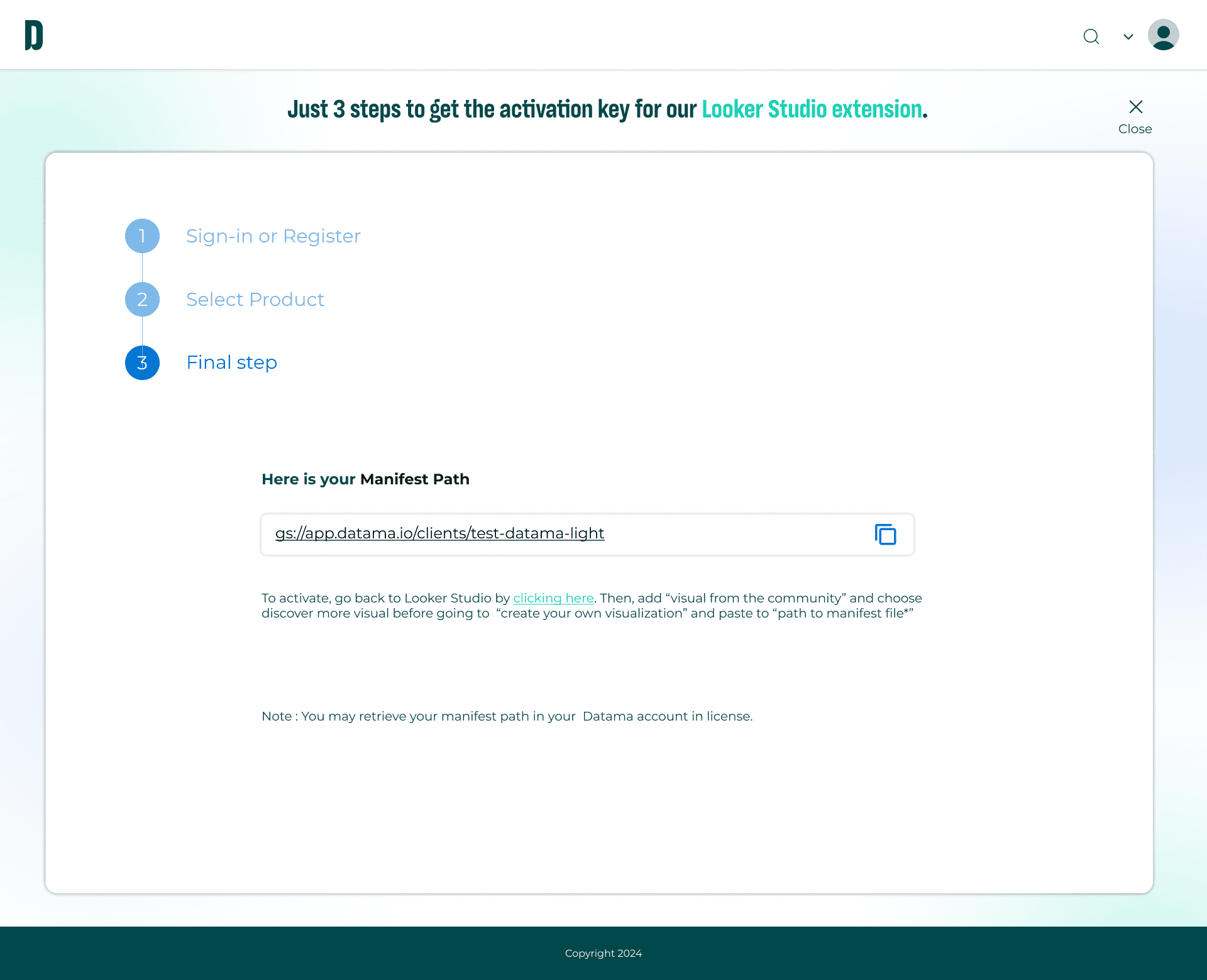
Step 3 → Final step (Manifest path)
The user receives clear instructions with a copy button, reinforcing completion.
Old Design

New Figma Design
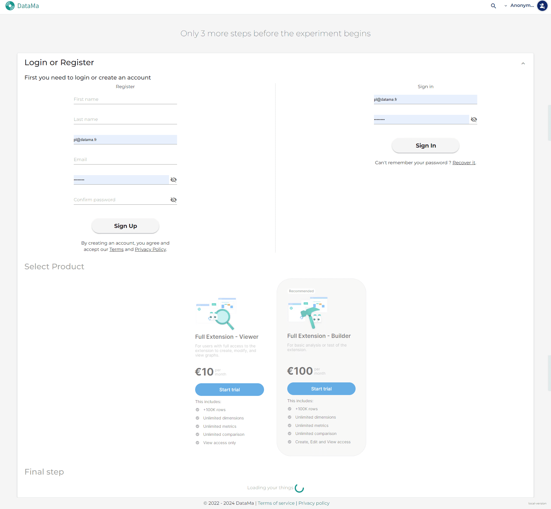
Old design
In the old version, all sections were visible at once : login, pricing, and final step, which overwhelmed the user and broke the flow.
CTAs like “Start Trial” appeared too early, before the user even signed in.
There was no step indication, making the process feel flat and confusing.
The final step (manifest path) was not visually emphasized and lacked proper instruction.
What was improved?
Restructured the flow into three clear steps using a left-hand stepper for better orientation.
Displayed each step only when relevant to keep users focused and reduce overwhelm.
Positioned CTAs contextually, centered and clearly connected to the active task.
Added the manifest path to the final screen with clear instructions and a copy button for ease of use.
Refined visual hierarchy, spacing, and flow to reduce cognitive load and improve clarity.

Challenges
At Prisma Media, I briefly worked under Ismaïl Hamila and got my first look at what a well-structured design system really feels like. Later, at Datama, I had the opportunity to build one entirely from scratch.
Instead of overcomplicating it, I grounded the system in what I already understood well: Google’s Material Design. It’s logical, widely adopted, and developer-friendly; which made it a reliable foundation. I began with a quick UI audit to identify inconsistencies, and from there, built a UI kit for buttons from scratch, designed for clarity and scalability.
Despite a tight timeline, I successfully developed a scalable button system while redesigning 5–15 screens that previously lacked cohesion or followed an outdated style. As the sole designer in a cross-functional team, I prioritized building a system that engineers could implement easily; making sure the final result was consistent, efficient, and ready to grow with the product.
Process
With limited time,
I prioritized efficiency.
1. Start with what works
I quickly studied best practices for button systems, I didn’t reinvent the wheel. I referenced Google’s Material Design; clean, logical, dev-friendly, and user-friendly. Then I ran a UI audit to spot inconsistencies and get a baseline for what to fix.
Below are snapshots of my early research and UI audit; referencing Google’s Material Design and analyzing existing component systems. This helped me define patterns, spot inconsistencies, and plan how to structure Datama’s design system from a real, functional base.
2. Putting the affordance and signifiers to start with what works
adasdasd


Buttons UI Kit
Bonus - some pointers for the developers ver 0.1
Incoming ver 0.2 late July!
Impact
What's the outcome of this?
To future-proof the product and reduce repetitive work, I built a scalable design system from scratch:
Created reusable, modular components that now support 15+ screens.
Reduced UI inconsistencies across the platform.
Anticipated future needs by designing a system that could scale as the product evolved.
Simplified developer implementation through consistent rules, clear documentation, and structured logic.
Conclusion
What I learn from this?
Built Datama’s entire design system and UI kit in Figma from scratch, ensuring speed, consistency, and scalability.
Designed modular components to reduce inconsistencies and future-proof the product.
Balanced a hybrid work rhythm (alternance), staying punctual and fast without sacrificing quality.
Structured Figma files and documentation to be usable by non-designers and easily digestible for developers.
Proactively explored Angular Material and Python to better collaborate with dev and data teams.
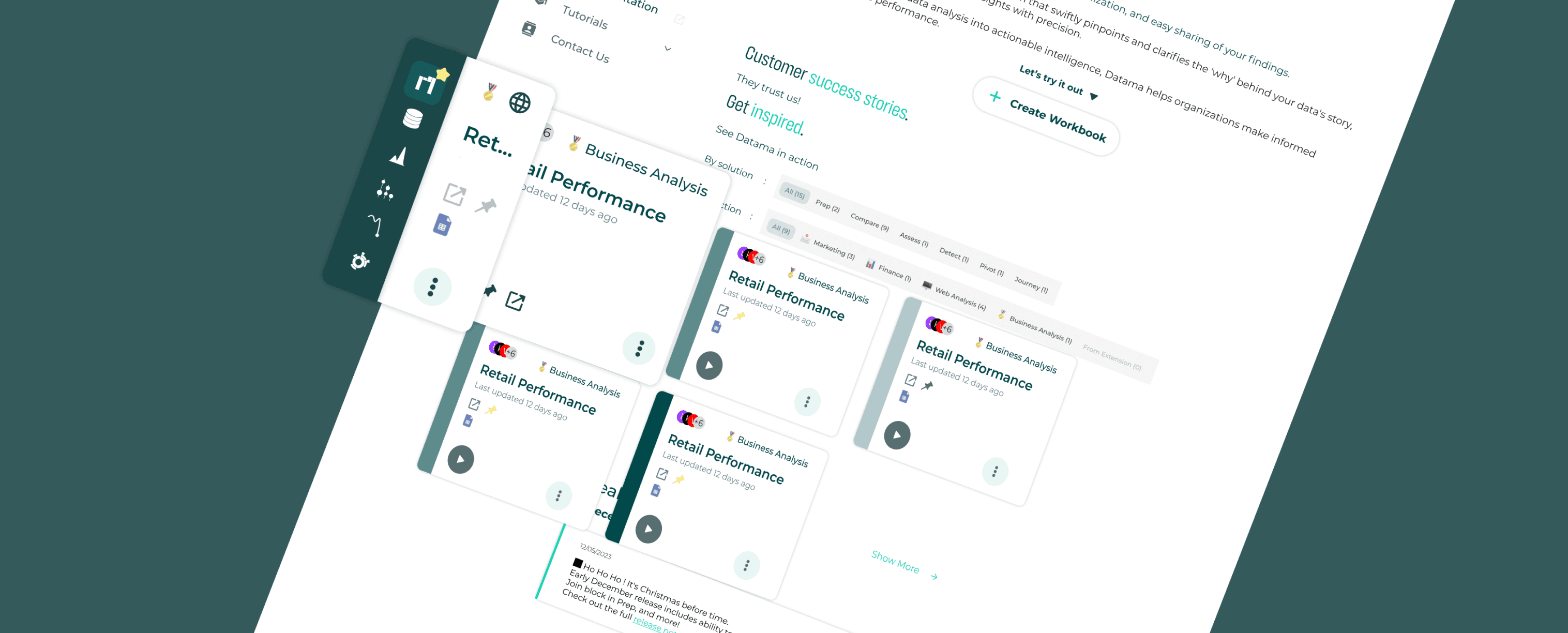
Led the homepage redesign, elevating brand perception and strengthening client trust through a cleaner, more strategic visual identity.
What's next?
I’d love to take the system further, run usability tests, improve accessibility, and refine components based on real user feedback. Ideally, I’d also want access to usage data to understand how the system impacts user engagement and overall product performance.
As an alternance product designer, I didn’t have full access to platform metrics; but I focused on what I could control: building something scalable, usable, and efficient for the team. That experience pushed me to think more systematically, and it made me want to go deeper. I’ll be continuing this work by building a new design system for [the next company] starting mid-July through the end of the month, an opportunity to apply everything I’ve learned, but with even more precision and intention.