Skills
• UI/UX
• Cross-functional Collaboration
• Visual Hierarchy & Layout Design
• Product Design
• Product Strategy
Role
Product Designer, UI/UX
Team
Stakeholders, developers, and a designer (me)
Timeline
4 Months
Overview
135%
Application adoption
Improved account growth and application adoption
375%
Growth Account Evolution
Alignment with the goal: application user → service
Who is Datama?
Datama is a B2B SaaS analytics platform focused on performance analysis and anomaly detection, backed by LVMH and supported by the WILCO accelerator.
Role & Processes
As the sole designer, I owned the end-to-end design process, from product redesigns and Figma systems to WordPress deployment and marketing assets.
I balanced business constraints with design quality while collaborating closely with developers and stakeholders.
The role strengthened my adaptability, stakeholder communication, and ability to translate qualitative feedback into product improvements.
Problem Statement
“Users found the platform overwhelming due to fragmented workflows, dense visualizations, and limited guidance for navigating features.”
Let’s fix that.
Initial project brief
Our team had a mission to redesign and rethink user experience of the homepage.

Method Used • Research
Simplicity & Validation
I simplified the interface by prioritizing the primary developer task and removing secondary elements. Internal walkthroughs revealed hesitation around key actions, leading me to refine hierarchy and improve visual clarity, reducing friction and increasing user confidence.

Technical Immersion (Mid-Project)
To better align the UI with real developer workflows, I attended a hands-on Python session to understand how tables and data structures are built programmatically.
Research
• Benchmark
• User interviews
• Journey analysis
Analysis
• Audit
• Problem framing
• Prioritization
Ideation
• Miro
• Team collaboration
• ChatGPT for exploration
Design
• Figma
• Design System
Impact
Removed guesswork, sped up bug fixes, and freed developers’ time from unnecessary meetings.
Design Decision
Improving First-Time User Onboarding
Before

After
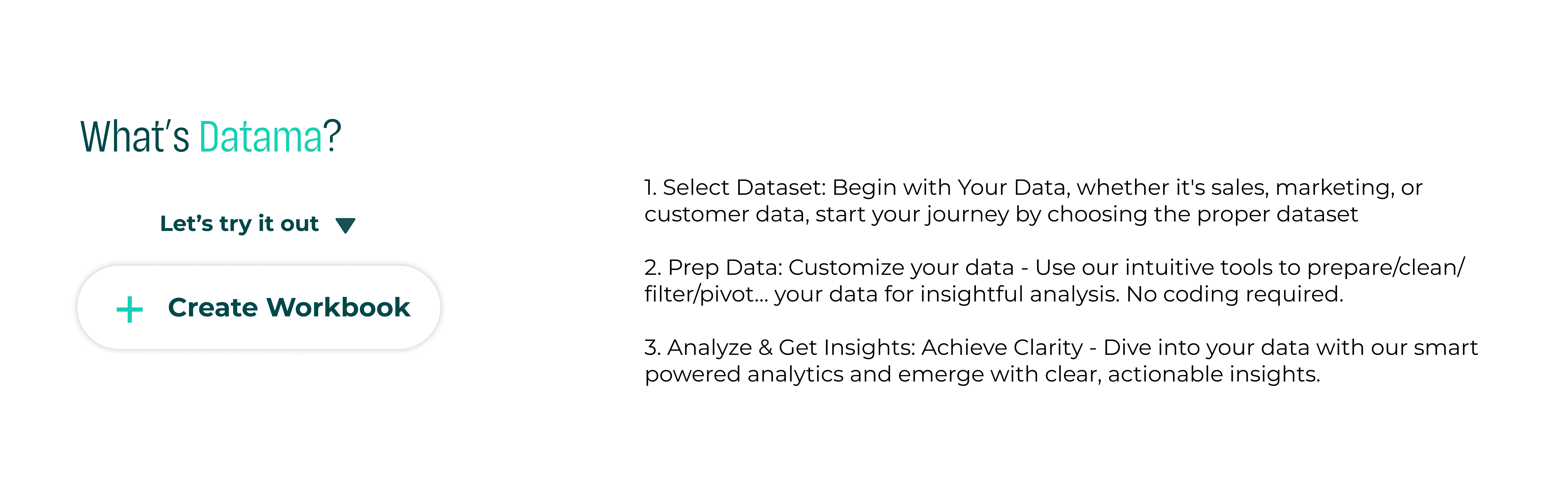
Challenge
Dense visualization, unclear progression, and absence of a primary CTA increased cognitive load and reduced task clarity.
Design Decision
Restructured the workflow into clear, sequential steps and introduced a strong primary action (“Create Workbook”) to guide users forward.
Impact
Improved task orientation and reduced decision friction during onboarding.
Improving Solution Discoverability
Before

After
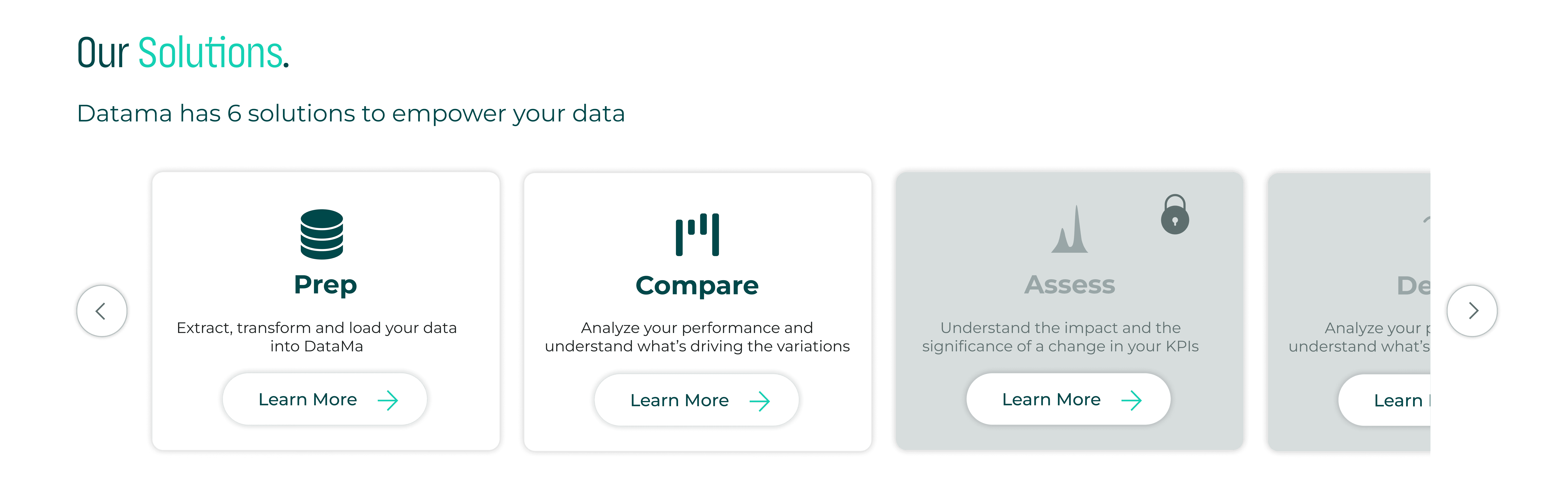
Challenge
Equal visual weight and inconsistent color usage made it difficult for users to distinguish between solutions or identify primary actions.
Design Decision
Introduced structured card hierarchy, consistent semantic colors, and clearer CTA emphasis to guide user attention.
Impact
Improved scannability and reduced cognitive load, making solution comparison faster and more intuitive.
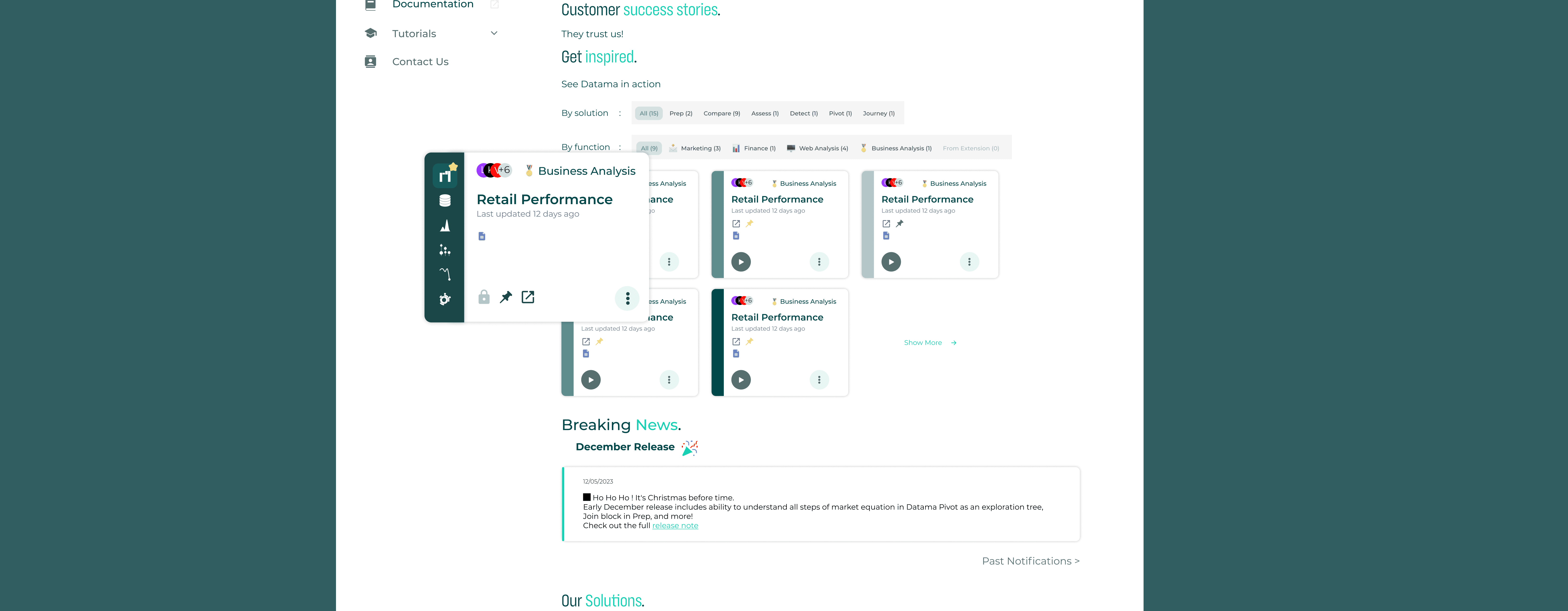
Improving Workbook Discoverability
Before

After
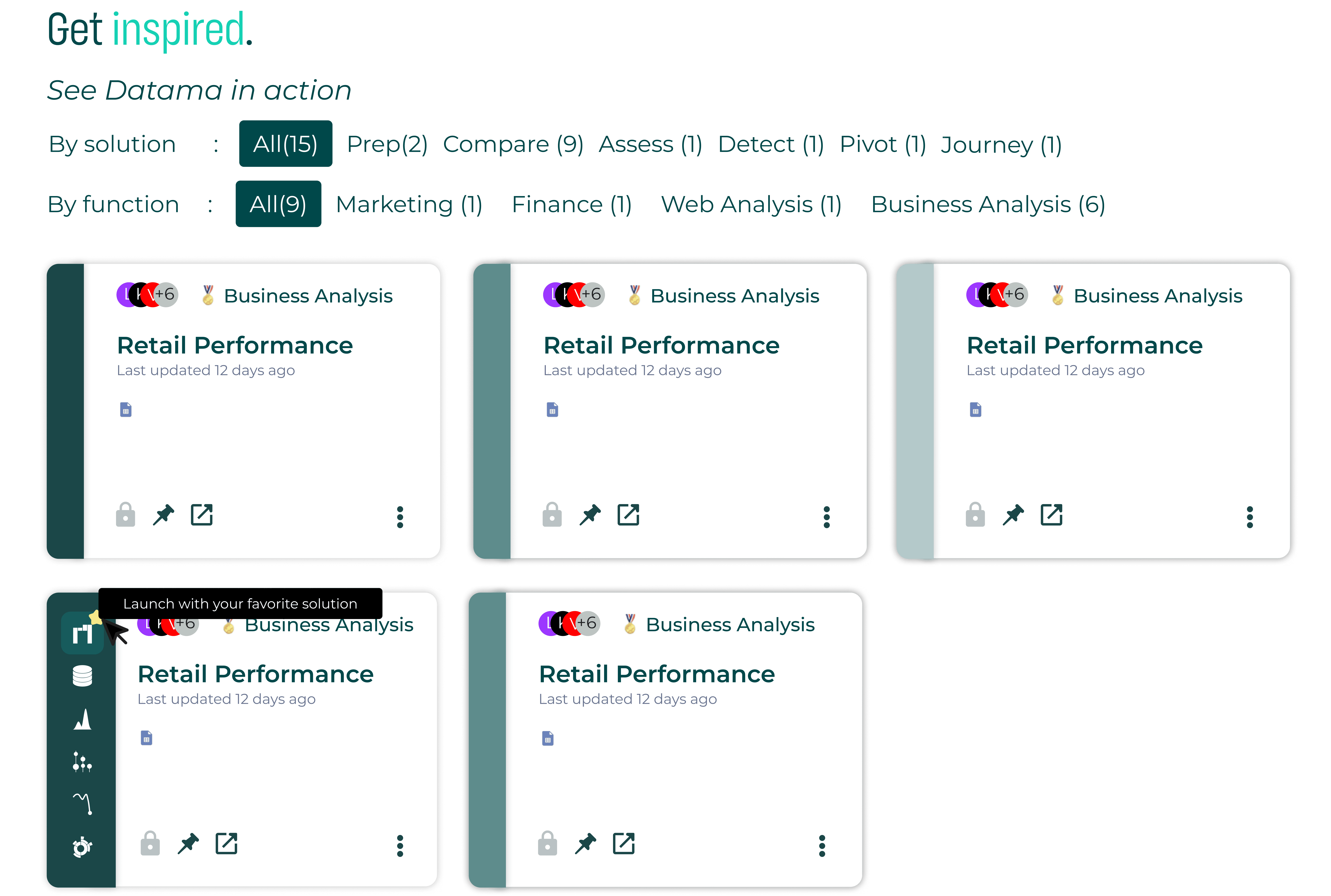
Challenge
Weak visual hierarchy and competing filters made it difficult for users to quickly identify relevant solutions.
Design Decision
Reorganized filter structure, strengthened card hierarchy, and clarified visual emphasis to improve scannability.
Impact
Enabled faster solution comparison and reduced cognitive effort when browsing available use cases.
Establishing a Primary “Create Workbook” Action
The homepage acts as the main entry point for users navigating the Datama platform. It allows users to explore analytics features and begin working with their data. However, there was no clear primary action guiding users on how to start creating a new analysis.
Before

After

Challenge
The absence of a visible “Create” action created uncertainty for users landing on the platform for the first time. Without a clear entry point, users had difficulty understanding how to begin their workflow.
Design Decision
Introduced a prominent “Create Workbook” button positioned in the top-right corner, following familiar patterns used in tools like Google Workspace and Excel. This placement aligns with common user mental models and provides a clear starting point for creating new analyses.
Impact
Clarified the platform’s primary action and reduced onboarding friction by giving users an immediate and recognizable way to start working with their data.
Improving Layout Clarity and Readability
The homepage combines multiple informational sections, including onboarding guidance, solution discovery, and product updates. However, the dense layout and limited spacing made it difficult for users to scan the page and understand the platform structure.
Before

After

Challenge
Dense visual layout and limited white space reduced readability and made it harder for users to identify key sections.
Design Decision
Refined spacing, increased white space, and reorganized content blocks to create clearer visual hierarchy and improve overall readability.
Impact
Improved visual balance and reduced cognitive load, making the interface easier to scan and navigate.
Refining Product Voice and Tone
The homepage greeting is one of the first textual interactions users encounter when entering the platform. Small wording changes can significantly influence how welcoming and approachable the product feels.
Before

After

Challenge
The original greeting (“Hi Anonymous”) sounded functional but lacked warmth and personality.
Design Decision
Explored more conversational microcopy and introduced “Welcome stranger to Datama!” to create a more welcoming and distinctive tone.
Impact
Created a more engaging first impression and helped establish a clearer product personality during onboarding.
One small note :
The phrase “Welcome stranger to Datama!” is memorable, but in a real product environment some teams might question the use of the word stranger. In this case study, I frame it as a reflection on tone, informed by what I later learned in my Conversation Design course, which strengthens the critical thinking aspect of the project.
Reflection
How I Validated the Redesign
Key Problems Solved
• Improved onboarding conversion by clarifying the primary action and simplifying workflow steps.
• Reduced cognitive overload by restructuring dense explanations into guided actions.
• Enhanced workbook discoverability through improved filtering and card hierarchy.
Next Steps & Product Evolution
To further evolve the product:
• Monitor key metrics over time: onboarding conversion rate, feature adoption, and filter interaction frequency.
• Introduce more advanced filtering options as user needs become more complex.
• Add a contextual guidance page to help users select the right workflow based on their goals.
• Continue iterative validation based on behavioral data rather than isolated feedback.
