Overview
This UI kit (Design system) contributed to:
25%
Developement Time
Improved account growth and application adoption
Most of us see design systems as a way to streamline workflows.
At Datama, I built the design system in Figma from scratch, working solo in a fast-paced startup environment. With no existing foundation, I ran a UI audit to identify inconsistencies, referenced Material Design for structure, and aligned components with the team’s Angular Material stack.
The system went beyond visual consistency. It enabled the team to prototype faster, test ideas more efficiently, and hand off designs more smoothly, freeing time to focus on building new features.
Every token, layout rule, and component was designed to reduce friction and support experimentation without chaos.
That’s how structure became a tool for innovation.
Problem
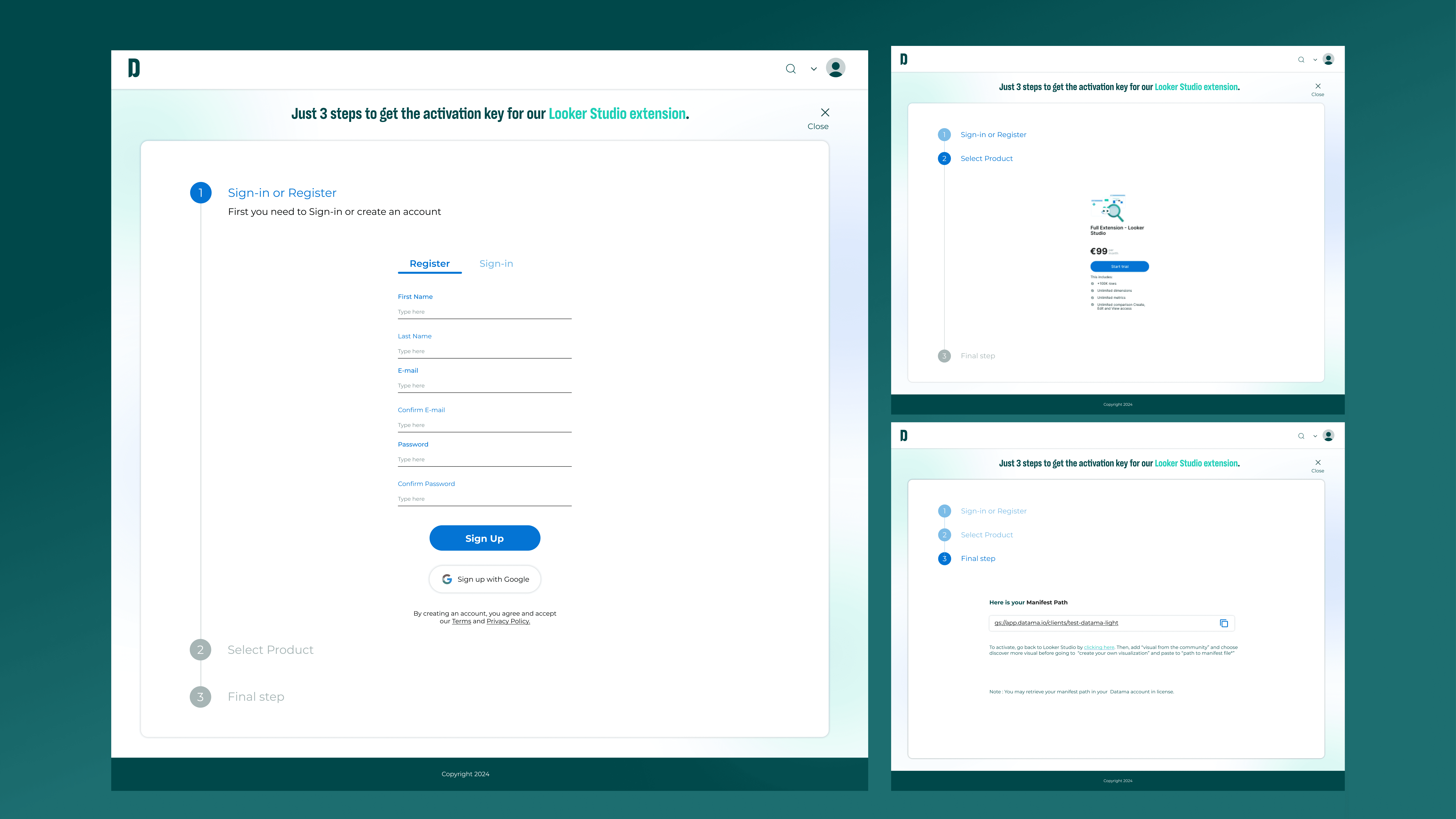
"As Datama revamped its brand, UI consistency became challenging. I implemented a token-based design system to unify components, cut rework, and save 25% of dev time."
Let’s fix that.
Redesign the visual hierarchy
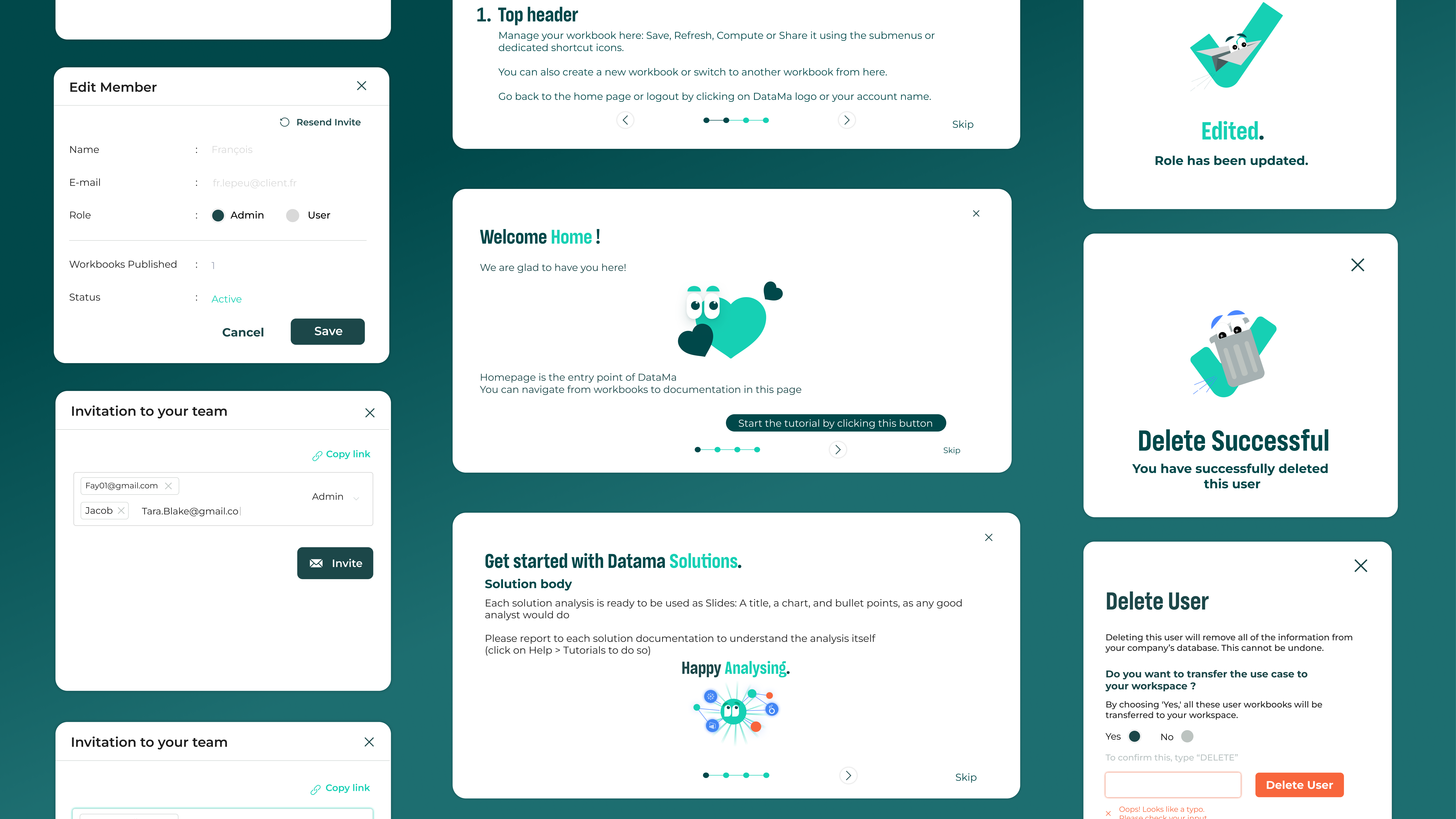
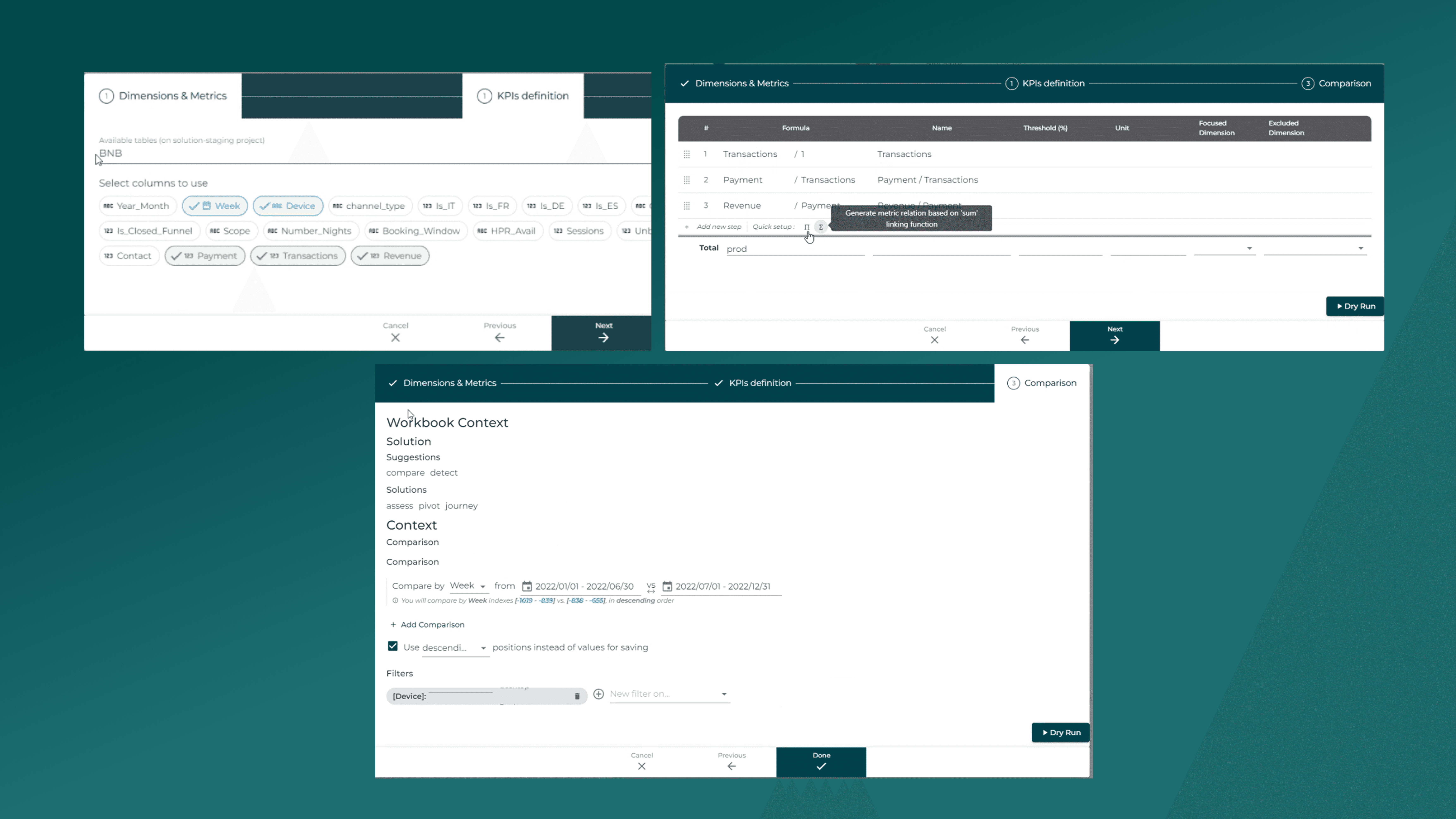
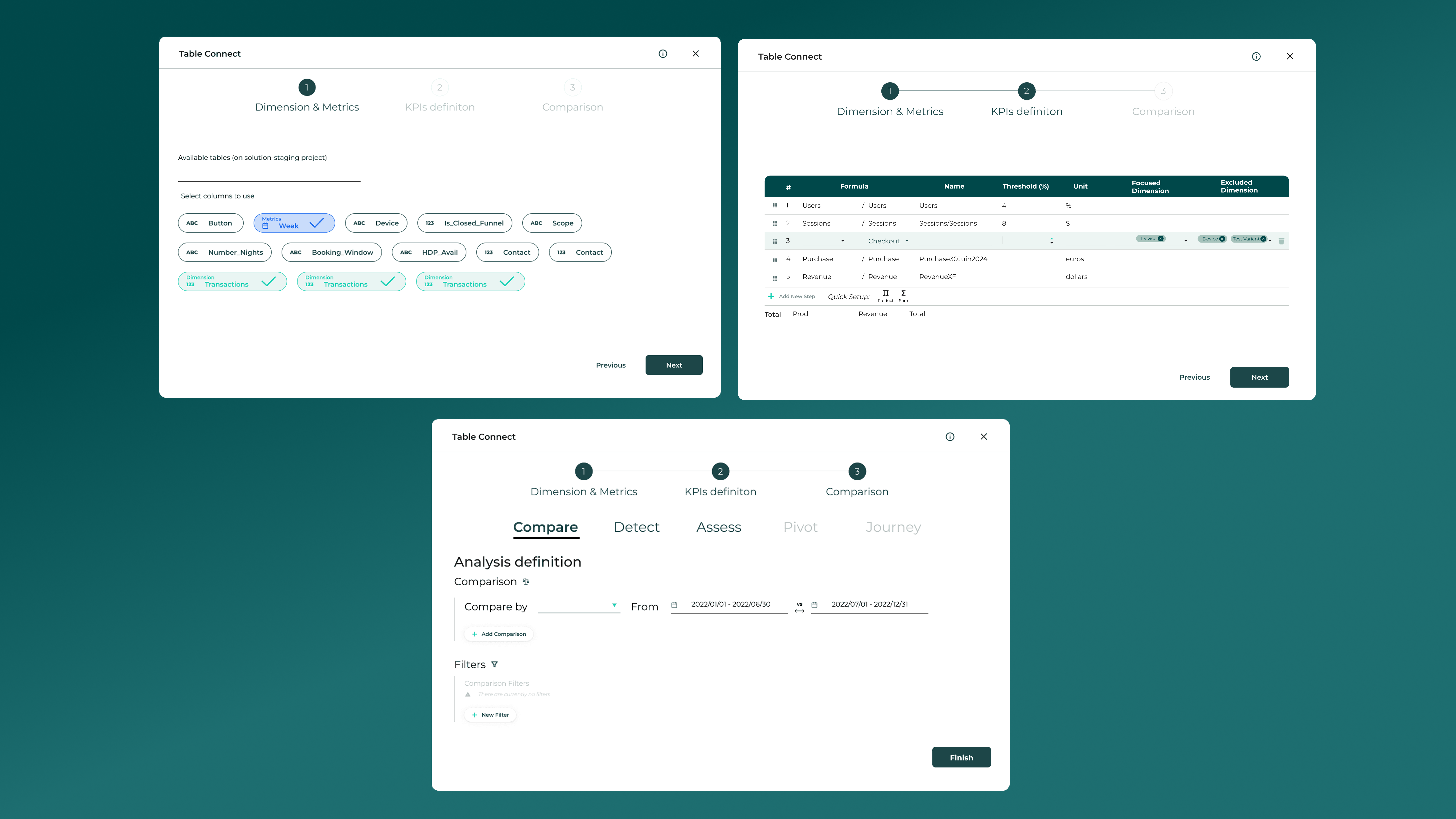
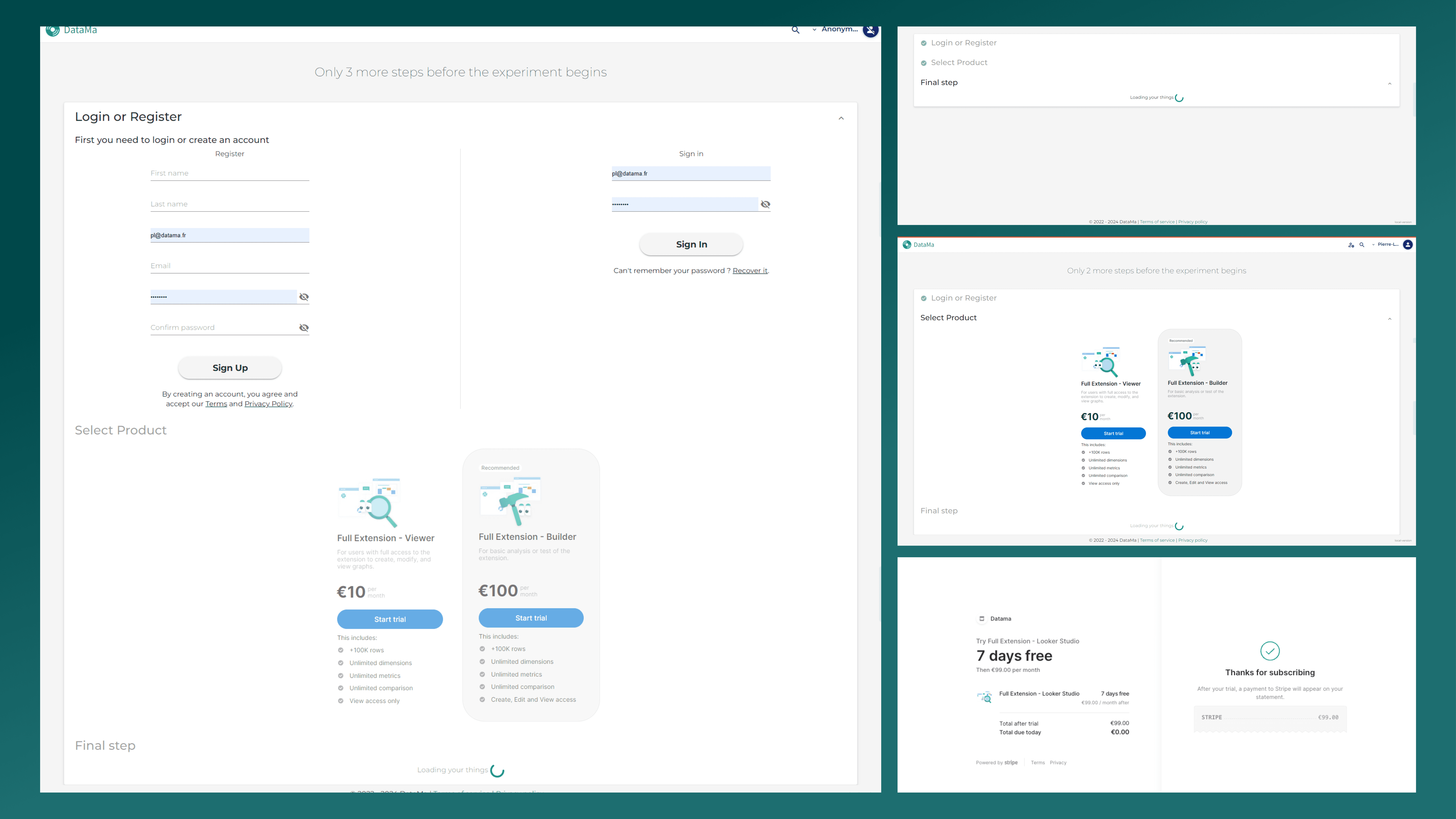
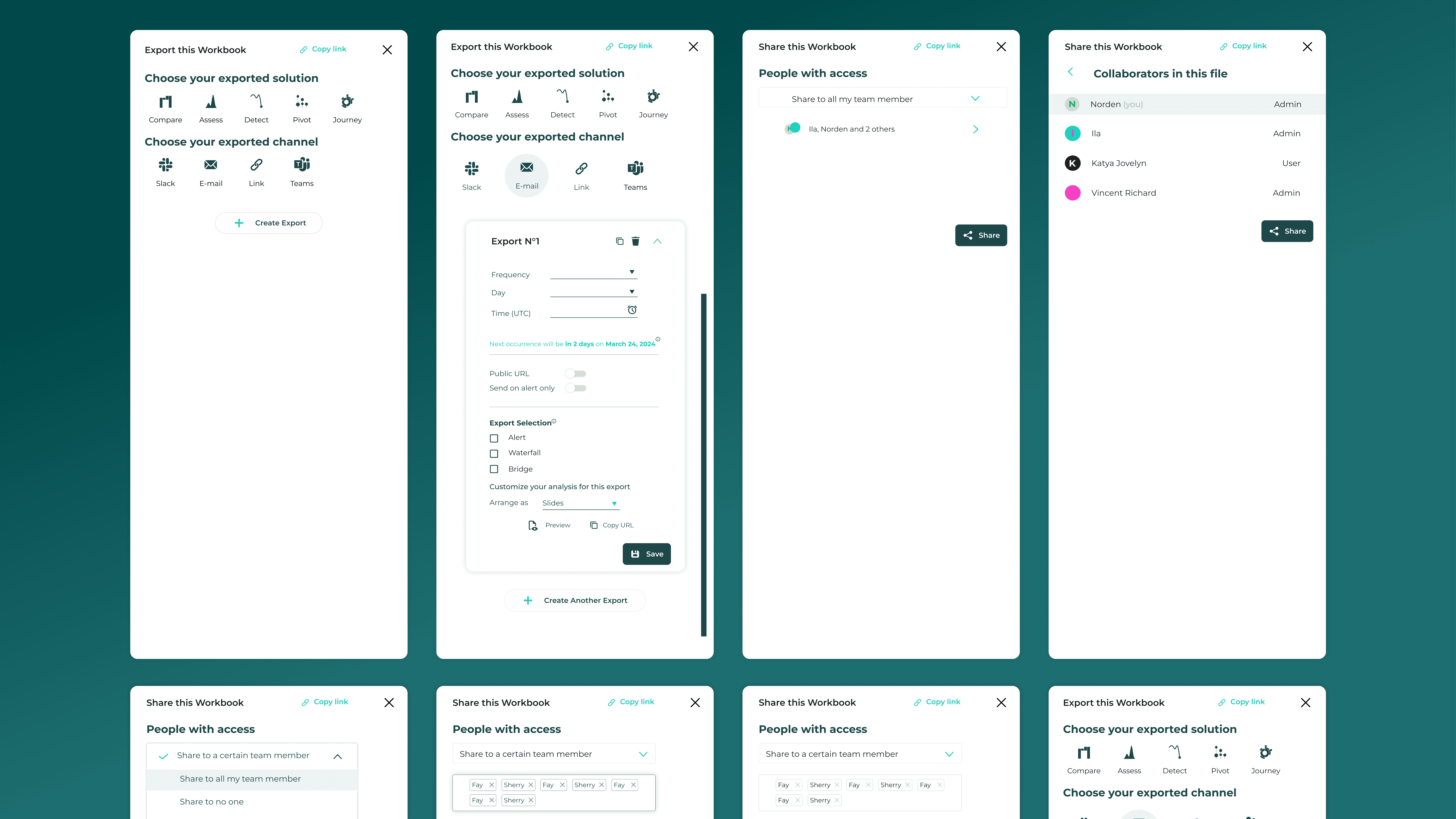
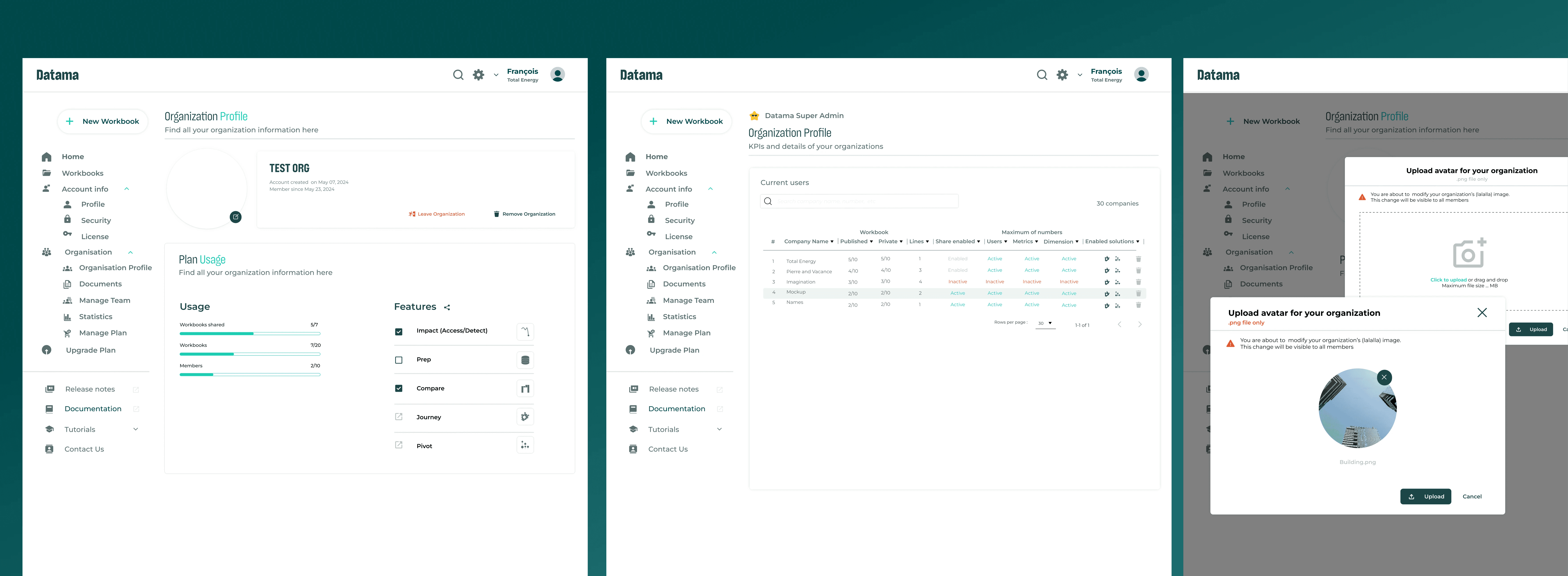
Without a shared system, every new feature introduced small inconsistencies, from button styles to layout decisions, that disrupted both the design flow and developer implementation.
It slowed down progress, caused unnecessary rework, and made the interface harder to maintain.
I introduced a scalable design system to streamline the UI and reduce friction between design and development.
Before
After
Before
After
Challenges
At Prisma Media, I briefly worked under Ismaïl Hamila and got my first look at what a well-structured design system really feels like. Later, at Datama, I had the opportunity to build one entirely from scratch.
Instead of overcomplicating it, I grounded the system in what I already understood well:
How I tackled this problem
Built on Material Design
Chose Google’s Material Design and angular for its logical structure and developer-friendliness, ensuring a solid foundation.
Scalable & Dev-Ready System
Designed a button system across 5–15 screens under tight deadlines, ensuring it was easy to implement, consistent, and growth-ready.
UI Audit & Button Kit.
Unified steps and component styles.
Method Used
Start with what works
Instead of reinventing patterns, I referenced Google’s Material Design as a foundation for consistent, developer-friendly UI.
I audited the interface to identify inconsistencies and rebuilt the button system in Figma using clear spacing rules and reusable components.
Don Norman's principle and signifiers and affordance
To improve usability, I focused on affordances and signifiers.
Buttons were redesigned so their hierarchy and function could be understood instantly, making interactions clearer without adding complexity.
I initiated a new approach: presenting three options to invite better feedback.
To encourage clearer team feedback, I introduced a process of presenting three design options during iterations.
This helped stakeholders compare alternatives and give more precise feedback, improving collaboration and decision-making.

Note
I lost my original data in mid-July last year, so this is a remake, a simplified snippet of what was once a more detailed system, including primary, secondary, and tertiary components.
Other works

Reflection
What I Built
Despite juggling multiple responsibilities at Datama, I rebuilt the UI button system from scratch while improving more than 20+ screens. This experience taught me how to balance speed, consistency, and scalability in a real product environment.These discussions helped identify hesitation points, clarify navigation flow, and refine the primary call to action.
What I Learned
Through the process, I developed practical skills in:
• Working in a hybrid rhythm while staying efficient
• Structuring Figma files for both designers and developers
• Collaborating with engineering and data teams using Angular Material and Google Material Design
• Leading a homepage redesign that improved brand clarity and trust
Key Problems Solved
Looking back, what I built was a foundation rather than a complete design system.
It addressed immediate product needs but lacked the governance and structure required to scale independently.
Next Steps & Product Evolution
If I continued developing the system, I would focus on:
• Conducting usability testing to validate interaction patterns
• Improving accessibility and alignment with WCAG standards
• Strengthening documentation and component governance for long-term scalability
