
Project Summary
Simplifying Complexity
Who is Datama?
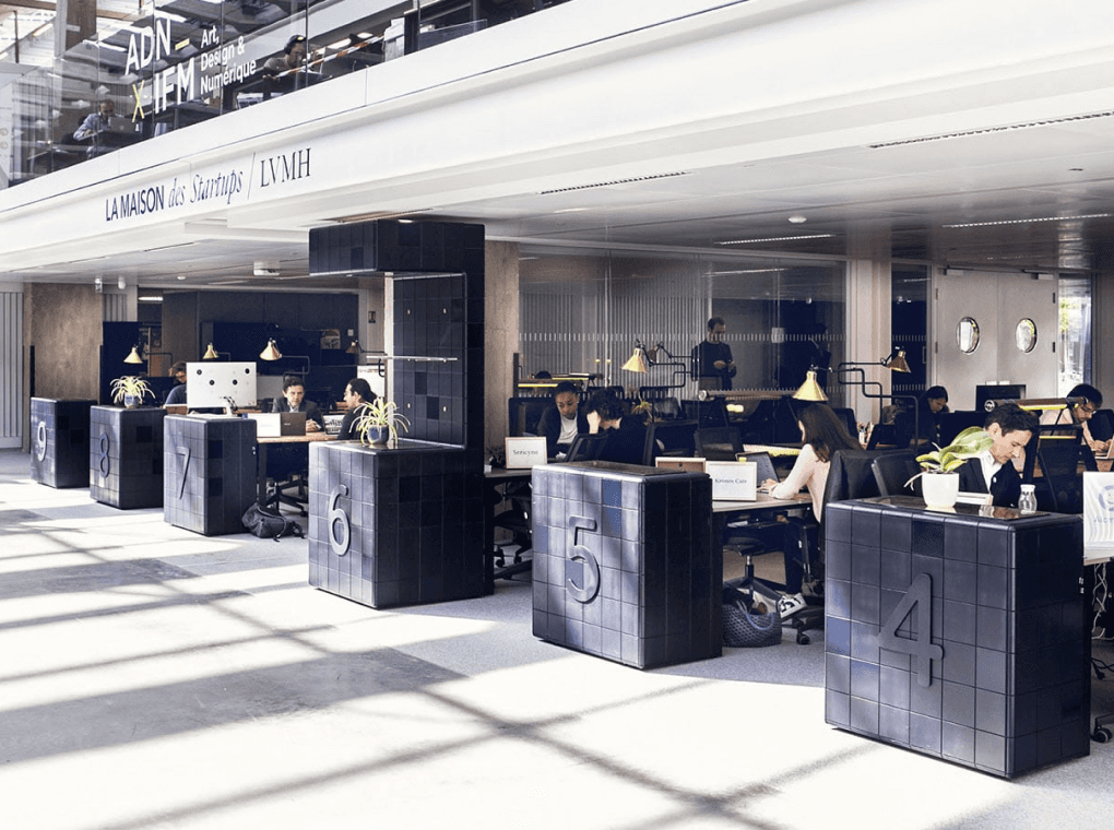
Datama is an data analytics SaaS B2B platform that simplifies performance analysis and anomaly detection, backed by industry leaders like LVMH and supported by the WILCO accelerator.
Role & Process
As the sole designer at the company, I lead the entire design scope from scratch, handling everything from video editing, including translating content from French to English, to illustration, LinkedIn banners, YouTube visuals, Figma to WordPress implementations, creation of design from scratch on a new development or features pages with redesign on Datama's products. I design certain parts from scratch in Figma and independently manage the deployment of the WordPress site (excluding the application and product-related areas), and many other things.
Being the only designer comes with its unique set of challenges; finding the right balance between business needs and design quality, compromising when necessary, setting clear expectations, and building efficient collaboration with the team.
Throughout this process, I’ve learned to adapt quickly, improve communication, and ensure design brings real value beyond just delivering polished screens. I also conducted internal feedback interviews to better understand how the team interacts with the product, focusing on qualitative insights and practical usage to refine the overall experience.

This how the cycle works in this company
Problem to solve
“Users found the platform overwhelming due to fragmented workflows, dense visualizations, and limited guidance for navigating features.”
Let’s fix that.
Goal
Methods Used
I approached the project by prioritizing clarity, reducing unnecessary meetings, and aligning stakeholders around what truly mattered, user needs and technical feasibility.
By applying the KISS principle (Keep It Simple, Stupid), I stripped unnecessary complexity and focused on direct solutions that aligned with what users and developers actually needed.
To streamline communication, I reviewed all assigned support tickets related to UX/UI pain points.
When details were unclear, I reached out directly to the originator or my direct manager, Loïc to clarify user needs or data logic.
This eliminated guesswork and helped developers stay focused on bug fixes and progress instead of meetings.
Impact: Developers regained productive time, and blockers were resolved faster.
Once issues were clarified, I moved into user-centric research:
Gathered references and visual ideas based on design thinking tailored to data scientists’ needs.
Aligned with stakeholders to understand what content mattered most and why they wanted a homepage revamp.
Consolidated options into a clear solution direction using prioritization matrices and feedback loops.
Three weeks after delivering the initial redesign based on their feedback, I proactively requested a formal system brief to clarify expectations across different user types. Since I didn’t have full visibility into all areas of the product, I reached out to those who knew the details best. Receiving the brief validated that our direction was aligned, allowing me to move forward with clarity and confidence.Ask ChatGPT
Datama (Super admin)
Anonymous
Free
Premium (Admin)
A’ I’ B’ C’ F’ G’
A’ I’ B’ C’ F’ G’
Z’ D’ I’ F’ G’
Anonymous
Free
Premium (Admin)
Premium (non admin)
A B C D E G
A F E D C G Z H
Z J E D G H
Z J E D G H
This page is one of five I redesigned to elevate the overall user experience from scratch. While only the homepage is showcased here, the same design principles; clarity, accessibility, and intuitive structure, were applied across the full interface.


What’s the differences?
Let’s break it down
1. “New Workbook” Button: Enhanced Discoverability

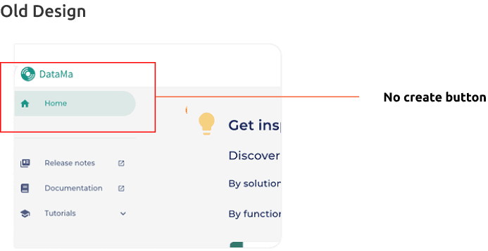
New Design
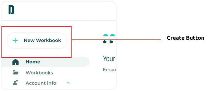
A prominent “+ New Workbook” button is now placed at the top of the navigation, leveraging familiar patterns from productivity tools like Lookers, Google Docs or Notion.
Encourages action faster, reduces friction, and improves user onboarding flow.
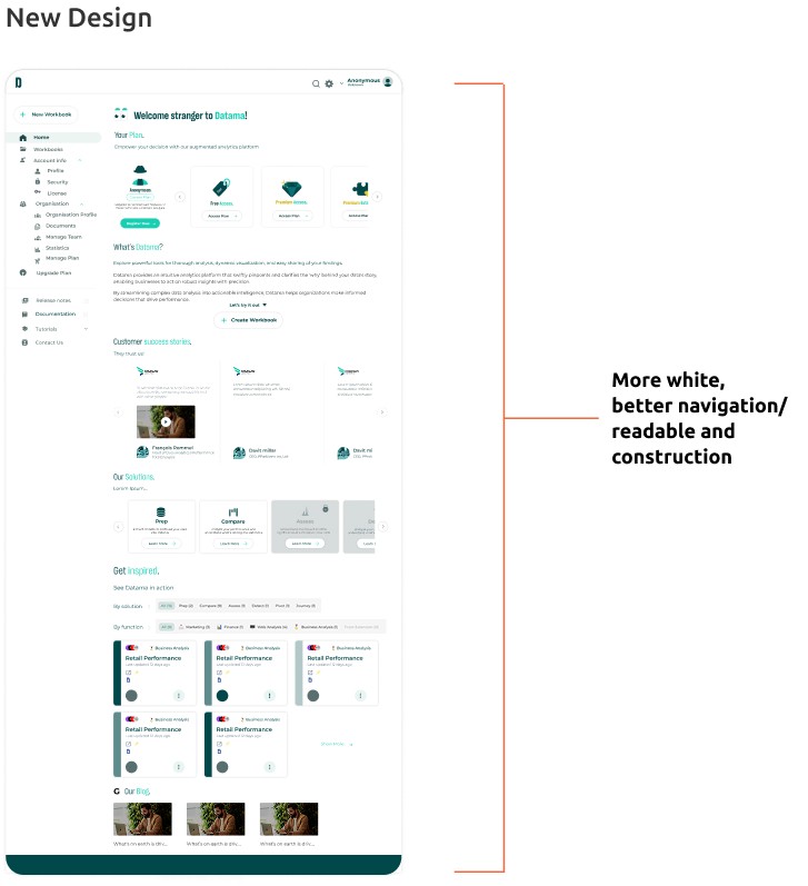
2. White Space = Clarity & Professionalism
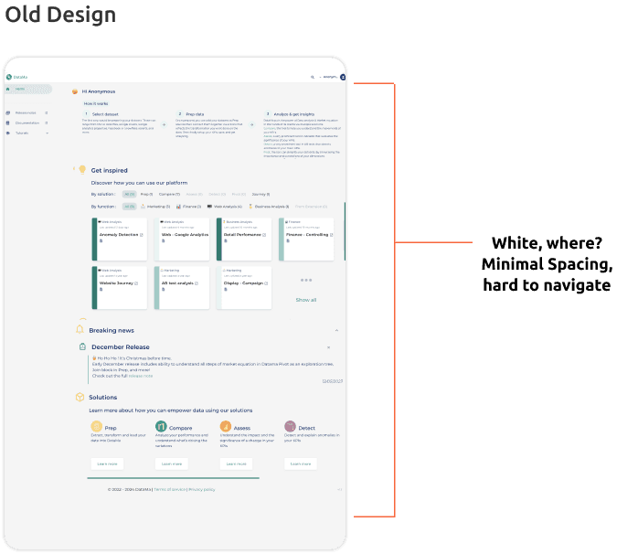
New Design

New Design:
Impact
Increased white space improves scalability
Better spacing enhances visual hierarchy
Layouts feels lighter and easier to navigate
Clearer separation between elements boosts focus
Reduces visual clutter and distraction
Faster understanding of where to click or look
Interface feels more polished and professional
Old Design
Bland, inconsistent greetings
Old Design:
Greetings is a little bit inconsistent from the other greeting that is provided.
New Design
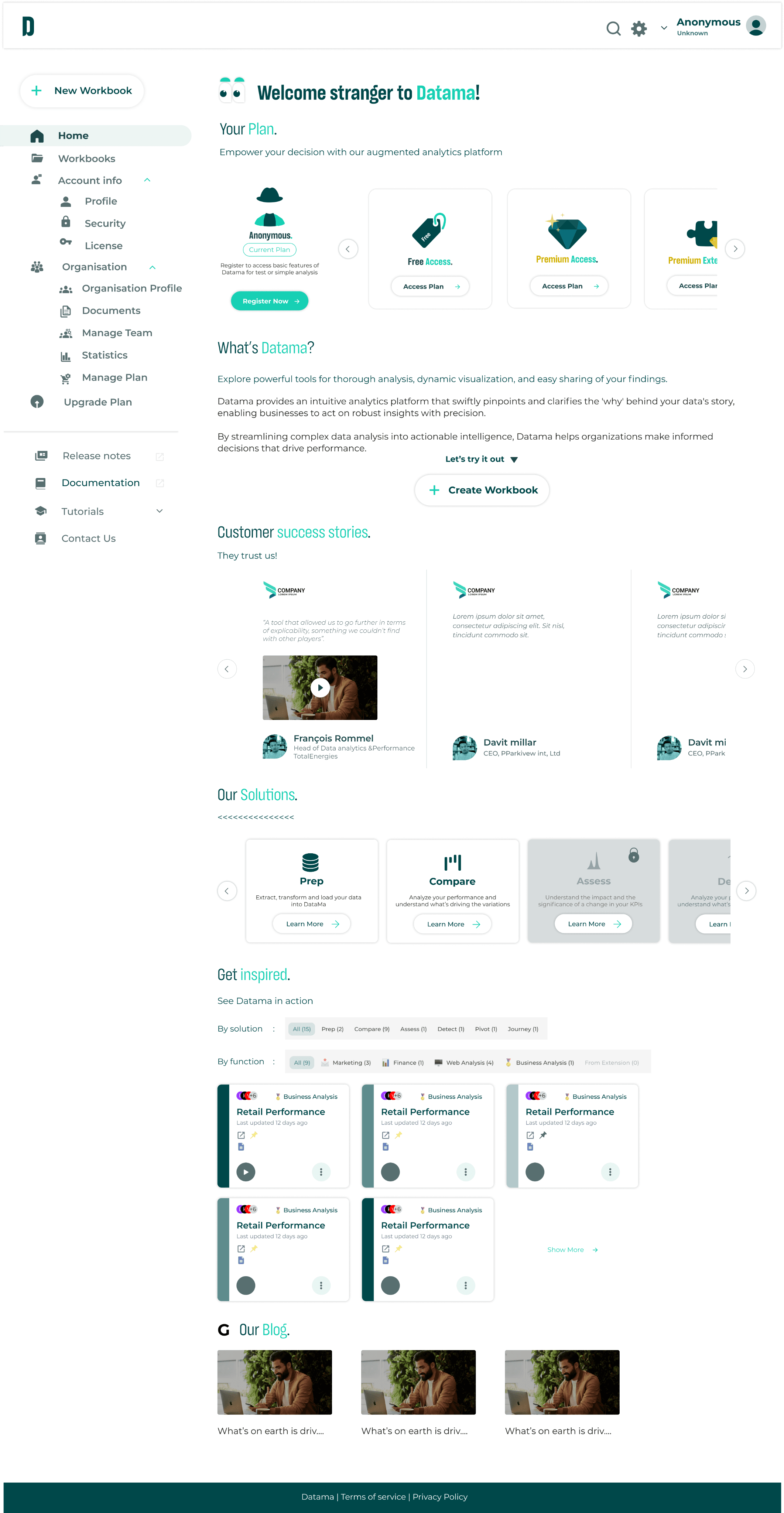
More Exclusive
New Design:
Introduced a warmer, friendlier greeting by replacing the generic “Hi Anonymous” with “Welcome, stranger” for first-time users. Once logged in, returning users are greeted with “Welcome back to Datama, [First Name]!”. setting a more personal, trustworthy tone from the very first interaction.
Impact
Creates emotional connection, making the experience feel warmer and more human; easing user onboarding and encouraging engagement.
Impact
What's the outcome of this?
Analysts were able to navigate and select data with less confusion.
The new design helped build trust in the platform by making interactions more intuitive.
The new interface design contributed to a 365% increase in application adoption, directly supporting the goal of making the application generate more income than service, a clear result of aligning intuitive UX and professional UI with real user behavior and business objectives.
Conclusion
What I'd do next?
Moving forward, I’d start by validating the redesign through usability testing with analysts and internal teams. I’d also keep an eye on long-term usage data to surface deeper pain points and better inform iterations. If I had the chance to do this again, I’d collaborate earlier with developers and stakeholders together at once to align from the beginning and reduce back-and-forth.
I’d also expand the design system to support more edge cases and new modules. And most importantly, I’d bring user interviews (Clients) into the earlier phases to guide decisions with actual insights, not just assumptions.
What I learn from this?
Translating abstract requests into actionable design
Communicating with non-designers in a technical setting
Prioritizing under pressure
Building clarity and logic into UI where none existed